Saturday, 4 July 2015

Defining Device Breakpoints for Blogspot Templates

device breakpoints for blogspot blogs

With so many Mobile Products in market where each smartphone or tablet has a different Screen size, it is important that we select some Content Specific Breakpoints so that your blogspot page may adjust and fit perfectly to the different screen sizes and may not looked squeezed or poor in resolution. Google recently rolled out a Mobile Friendly update on April 21, 2015, which boosts the ranking of mobile-friendly sites on mobile search results.  Google no longer favors fixed width layouts and recommends that all sites must be made fluid and responsive, where text should be readable without tapping or zooming, tap targets are spaced appropriately and the page avoids unplayable content or horizontal scrolling.

Therefore follow this interesting tutorial series in order to make sure you keep receiving traffic to your blogspot blogs from mobile phones and receive a Mobile-Friendly Label from Google.

Tutorial Series
2. Common Device Breakpoints For a Responsive Blogspot Template
3. Hiding Widgets & Scripts in Mobile Templates [1], [2]
7. Make Blog Sections Responsive: Header Widgets, Posts + Sidebar, Footer

What are Breakpoints?

Breakpoints are points at which your layout design breaks or crashes. Breakpoints are CSS3 Media Queries that tells the browser which Layout to load for your website based on the screen size (viewport). It controls the display of your user interface (UI) on mobile devices.

Suppose your Navigation Menu may look fine on a Laptop or Tablet but it may look broken, horizontally scrolling the page on a small hand phone set containing a width less than 480px. The Menu tabs may look misaligned or out of position. This is the time when you will need to specify a different custom Layout using CSS styles for your menu for the breakpoint 480px so that your menu may look just fine on small screen sizes. The browser will load that Menu styles (layout) only when the screen size of the device is less than 480px.

Done with theory now lets start converting your Blogspot template into a Responsive Template!

Disable Blogger Default Mobile Template

Since we are designing a custom responsive template for your blog therefore we don't need the Default Mobile View templates offered by blogger. It is important to disable it else you will not be able to see the custom mobile changes we will make in this tutorial series.

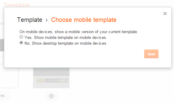
1 Go To Blogger > Template

2 Click the Gear Icon

3 Choose "No, Show desktop template on mobile devices"
disable mobile template in blogger


4 Click Save

5 Next Click Edit HTML and search for this code if in case it exists in your template else ignore this step and follow step#6.

<b:if cond='data:blog.isMobile'> <meta content='width=device-width,initial-scale=1.0,minimum-scale=1.0,maximum-scale=1.0' name='viewport'/> <b:else/> <meta content='width=1100' name='viewport'/> </b:if>

Delete the code above if you found it.

6 Paste the following meta viewport code just below <head>

<meta content='width=device-width, initial-scale=1, maximum-scale=1' name='viewport'/>

The code above gives information to the web browser about the screen size of the mobile device.

7 Save your template

Mobile Friendly Breakpoints For Blogspot blogs

Choosing the right breakpoints for any platform is the most complex task but it can be made quite easy if you apply the rule of KISS to it i.e. Keep it Simple Stupid!

We have defined below some of the most common Content Specific Device Breakpoints for blogspot blogs which respond quickly to changes in viewport. We will term it as the Responsive Cheat Sheet.

Note that we have used CSS3 Media Queries by Keeping Apple Devices as standard for simplicity but the breakpoints below cover all major brands like Samsung, Black berry, Nokia, Windows Phone, Kindle, Nexus and so on.

1 Go To Blogger > Template > Backup your template

2 Click Edit HTML

3 Search for  ]]></b:skin>  and paste the following CSS Code just below it:

<style>

/* ########  Responsive Cheat Sheet ########### */

/*-----iPhone 2G, 3G, 4, 4S Portrait View ZONE1 ----------*/

@media only screen and (max-width:320px) {

}

/*-----iPhone 2G, 3G, 4, 4S Landscape View ZONE2 ----------*/

@media only screen and (max-width:480px) {

}

/*-----iPhone 5,6 ZONE3 ----------*/

@media only screen and (max-width:568px) {

}

/*-----iPads, Tablets ZONE4 ----------*/

@media only screen and (max-width:768px) {

}

</style>

4 Save your template and you are almost done!

The above are the only breakpoints required to make any blogger template responsive. You don't need combined or separate breakpoints for landscape and portrait view. The above Cheat Sheet is enough to make everything work just fine!

How these breakpoints work?

The yellow highlighted regions above are viewport sizes that defines the CSS Styles for a particular screen size. The CSS styles for each screen size will be defined inside these viewports.

By max-width:480px we mean width less than or equal to 480px. Styles inside this breakpoint will load only when the screen size is less than or equal to 480px.

For example If you wish the Sidebar Column which has a CSS Class .sidebar and width 300px, to have a 100% width in a Mobile Phone then you will add its new width inside ZONE1 breakpoint (inside the curly braces) as shown below

/*-----iPhone 2G, 3G, 4, 4S Portrait View ZONE1 ----------*/

@media only screen and (max-width:320px) {

.sidebar {width:100%; overflow:hidden;}

}

That simple!

Note that none of the codes above will make your blog mobile friendly yet. The above guide is the skeleton/basic structure for a responsive layout. Your blog template will be fluid once you cover and follow all parts of this tutorial series.

Need Help?

Let us know if you need further clarification on any concept. I would love to answer all your questions posted in the comment form below. A lot more interesting parts are on its way. In our coming tutorials we will learn in detail how to insert the new responsive styles correctly inside the breakpoints specified above for different components/widgets of your blog. Make sure to Subscribe to our Email newsletter to ensure you don't miss any update.

Peace and blessings buddies! =)

Design a Responsive Blogger Template - Tutorial

Design Responsive Blogger TemplateDesigning Mobile Responsive Templates has become a trending topic in web today. Mobile Technology and Mobile Traffic has evolved immensely from 2010 to 2013 especially in Asia USA and Africa. People now prefer reading emails on their iPhone as compared to using their Desktop computer. Fast wireless wifi connections is another reason that encouraged usage of mobile devices like smart phones (Apple and Android), Tablets, netbooks and low resolution cellphones like NOKIA.

More of our clients today are interested in fluid and flexible Blogger templates compared to traditional Fixed width Layouts. We have received over a hundred requests for this tutorial series. We are therefore releasing the first ever complete step by step Tutorial Guide on Mobile Optimized Responsive Blogger Templates to the Google Blogger Community. You will learn how to enable your Blog layout adjust itself automatically to the Device Screen Size.

Tutorial Series
1. Design a Responsive Blogger Template
3. Hiding Widgets & Scripts in Mobile Templates [1], [2]
7. Make Blog Sections Responsive: Header Widgets, Posts + Sidebar, Footer

Note: You are reading Part 1. Read it only for understanding the theory behind what Mobile friendly blogspot templates are. We will do the coding part from Part 2 onwards which is Common Device Breakpoints.

What is a Responsive Layout?

In layman terms a responsive webpage is a flexible design that adjusts its width and styles according to user device Screen size. It will look different on a Desktop Screen and much different on a smart phone or Tablet (has two sizes: portrait and landscape) . No matter what device you use a responsive design will adjust itself perfectly to give you a Clean user interface.

For Blogspot Users:

If you have activated Mobile view for your blogger blogs then if you view your blog in a smart phone, you will find its look completely different compared to a desktop. By default all blogger blogs are made mobile optimized but those styles are too simple and doesn't represent the blog in its true form therefore we will learn to create a custom designed Mobile Friendly layout for Blogger ourselves. This will allow you to customize your mobile Template and have a better control over the display of elements such as Ads and widgets on your site.

Therefore in our case we don't need the default mobile view at all and we have disabled it completely.

Mobile view Disabled in Blogspot

See it yourself!

An example of a responsive website is the latest design of MyBloggerTricks.com. Just view it using this amazing tool linked below. Observe clearly how its Menu changes as the size of the screen shrinks. You can also test it by simply adjusting your browser window size using your mouse cursor!

MBT view in iPhone

Just insert the following URL in the Input Field

http://mybloggertricks.com?m=1

Testing Responsive Designs

Are you too late?

If your blog layout doesn't support auto adjustment of layout and loading of new stylesheets based on Device width then you don't need to worry because Responsive layouts is a new idea and it will take time till everyone applies it. You wont believe this but Giant Corporate sites like TechCrunch have not yet upgraded their theme to a responsive one and moreover Google is so slow that it has not even introduced auto-width-adjusting AdSense Ads for such fluid layouts.  So it will take time till this new terminology is well acknowledged by majority of websites and internet firms.

Update: TechCrunch is now responsive and Google now favors Mobile friendly Pages. Google now ranks Mobile friendly blogs better and give them preference in Mobile search results over sites which are not yet mobile optimized. So hurry up and save that precious mobile traffic which you might be loosing at this moment!

How are Responsive Layouts Designed?

If you know some basics of HTML and CSS then trust me you are going to find it extremely easy and you would love to play with your layout columns using just your browser. CSS3 has introduced several new techniques of achieving some frequently used functions. It is no more limited to just styles but it now supports some really interesting front-end programming functions like @import, counter-reset, animations, transitions etc. and the most popular amongst them are Media Queries (@media ) that acts like conditional IF statements used in blogger.

Normally mobile browsers emulates a desktop view by squeezing big resolutions into small screens that is often difficult to read and browse. You must be familiar that how difficult it is to click a web link in iphone unless you zoom it.. In order to tell the browser to detect the screensize we will add a META viewport tag inside <head> section of your layout.
 

Any Template can be converted into a flexible layout in just two simple steps:

1. Add Meta Viewport just below <head> tag

<meta name="viewport" content="width=device-width, initial-scale=1, maximum-scale=1"/>

Here width=device-width will detect the screen size.

2. Use CSS3 Media Queries

Update: Ignore the Breakpoints below and instead follow our detailed tutorial on Defining Device Breakpoints  discussed in Part 2 

Media Queries are conditional CSS3 queries that detects screen size and applies the relevant stylesheet to that screen. For example see these two media queries for smart phones and Tablet devices.

@media screen and (max-width : 480px) {

/* If screen size less than 480px Load these styles */

/* Done for Smart Phones */

}

@media screen and (max-width : 768px) {

/* If screen size less than 768px Load these styles */

/* Done for Tablets */

}

Here are some interesting tips that you keep in mind throughout this tutorial series:

Tips To remember:

  1. Use percentages instead of numeric values to define width of columns
  2. Create Separate Style sheets for Three Major Breakpoints  320/480/768
  3. Remember to use box-sizing, max-width and min-width properties

Need help?

This was a brief introduction of how exactly a responsive layout is designed and what makes responsive websites so important today. I just hope I did justice with the post by making it as easy as possible. Please be aware that responsive web design requires a significant amount of testing to make sure your site looks good on all devices and browsers, you may want to look into a variety of test management tools in order to expedite the process. If you are facing confusion in any part just feel confident to leave your precious comment in the comment box below and I will be at your service 24/7. Please let me know how useful was this tutorial for you and did it help answering most of your questions?

Wish you peace and blessings buddies :)

Wednesday, 24 June 2015

Twitter Button adds a horizontal scrollbar to the page - [FIX]

twitter follow button causing horizontal scrollingRecently more and more people are experiencing problems with poor social media plugin UI. Twitter Follow button despite being mobile responsive messes up the site design by adding a long Horizontal Scrollbar to the bottom of the page temporarily for a few seconds and then it disappears. The Follow button is forcing the entire webpage to scroll horizontally. You might have seen a long green scrollbar at the bottom of our blog too. Upon debugging the site I found that the scrollbar was actually caused by the Twitter hub.html frame that renders within our site.

According to its developer benward the positioning of the hub frame is purely vertical (negatively positioned above the top of the page) however for some reasons we found that the webpage is forced to change its width dimensions. I have a simple fix for this bug that will prevent the Hub Iframe from exceeding a specified Parent container width size.

Prevent Hub Iframe From Causing a Horizontal Scrollbar

I am sharing the steps for blogspot blogs. The method described below is a standard procedure that applies to all platforms.

1 Go To Blogger > Template > Backup your Template

2 Click Edit HTML

3 Paste the following Style just above ]]></b:skin>

Simple Enclose your twitter Follow button Code inside the following Parent container

.twitterButtonFixmbt {position:absolute; overflow:hidden; max-width:300px;}

4 Save your template


Now enclose your twitter button code inside these Div tags

<div class="twitterButtonFixmbt ">

ADD Twitter Follow button code or Tweet button code here

</div>

That's it!

How it works?

I have enforced a maximum width of 300px and you can surely change it as per your container width. The position absolute and overflow properties along with max-width will make sure the Iframe doesn't exceed the prescribed Parent Dimensions.

Let me know if you needed any help. Peace and blessings buddies :)

Saturday, 20 June 2015

Horizontal Divider Line With Back-To-Top Button - [Shortcode]

Horizontal Divider ShortcodeYou are quite aware with HTML hr tag that defines a thematic break in a HTML page that can be a shift of topic or a section division.  The hr element is used to separate content in an HTML page. While writing blog posts, it makes a lot of sense to format your content well and present long lengthy content in sections rather in a single plain text, in such case CSS3 Dividers help a lot and to make it even more effective, we have included a smooth scrolling back-to-top link in the horizontal divider that takes a user back to the top of the page content. The BacktoTop button will display only when the content is long enough else it will auto hide itself. It will appear when a user scrolls down but would disappear as a user scrolls up. We have created around 5 Color Skins in two different themes, one with Solid color and one with Fading effect. The Hr Tag is created using Blogger Shortcode Plugin, the complete Toolkit For blogspot blogs.

Since Blogspot blogs are coded with XHTML therefore the <hr> tag must be properly closed, like this: <hr /> however in HTML, the <hr> tag has no end tag. So we have taken care of the same standards.

The Five color themes are

  1. black, fblack
  2. red, fred
  3. green, fgreen
  4. pink, fpink
  5. yelow, fyellow

PS: where the f versions are faded themes. As you would see in the demo below.

1. Install Blogger Shortcode Plugin

In order to use Divider shortcode you must first install the shortcode plugin for your blogspot blog by following 7 easy steps shared in the link below:

Skip installing it if you have already added it in your blogger template

2. Add Styles and Script

1. Go To Blogger > Template > Backup your Template
2. Click "Edit HTML"
3. Search for this code ]]></b:skin>
4.  Paste the following Code just above it

/*------- Shortcode Divider -------*/

    .sc-divider{margin:10px 0;height:20px;padding:0}.sc-divider hr{margin:0;position:relative;height:2px;border-bottom:2px solid;border-top:0;border-right:none;border-left:0}hr.fgreen{border:0;height:1px;background-image:-webkit-linear-gradient(left,rgba(112,207,10,0),rgba(112,207,10,0.75),rgba(112,207,10,0));background-image:-moz-linear-gradient(left,rgba(112,207,10,0),rgba(112,207,10,0.75),rgba(112,207,10,0));background-image:-ms-linear-gradient(left,rgba(112,207,10,0),rgba(112,207,10,0.75),rgba(112,207,10,0));background-image:-o-linear-gradient(left,rgba(112,207,10,0),rgba(112,207,10,0.75),rgba(112,207,10,0))}.sc-divider a.fgreen{border-color:#70CF0A;color:#70CF0A}hr.green,.sc-divider a.green{border-color:#70CF0A;color:#70CF0A}hr.fred{border:0;height:1px;background-image:-webkit-linear-gradient(left,rgba(252,64,44,0),rgba(252,64,44,0.75),rgba(252,64,44,0));background-image:-moz-linear-gradient(left,rgba(252,64,44,0),rgba(252,64,44,0.75),rgba(252,64,44,0));background-image:-ms-linear-gradient(left,rgba(252,64,44,0),rgba(252,64,44,0.75),rgba(252,64,44,0));background-image:-o-linear-gradient(left,rgba(252,64,44,0),rgba(252,64,44,0.75),rgba(252,64,44,0))}.sc-divider a.fred{border-color:#fc402c;color:#fc402c}hr.red,.sc-divider a.red{border-color:#fc402c;color:#fc402c}hr.fblue{border:0;height:1px;background-image:-webkit-linear-gradient(left,rgba(41,183,255,0),rgba(41,183,255,0.75),rgba(41,183,255,0));background-image:-moz-linear-gradient(left,rgba(41,183,255,0),rgba(41,183,255,0.75),rgba(41,183,255,0));background-image:-ms-linear-gradient(left,rgba(41,183,255,0),rgba(41,183,255,0.75),rgba(41,183,255,0));background-image:-o-linear-gradient(left,rgba(41,183,255,0),rgba(41,183,255,0.75),rgba(41,183,255,0))}.sc-divider a.fblue{border-color:#29b7ff;color:#29b7ff}hr.blue,.sc-divider a.blue{border-color:#29b7ff;color:#29b7ff}hr.fpink{border:0;height:1px;background-image:-webkit-linear-gradient(left,rgba(255,131,119,0),rgba(255,131,119,0.75),rgba(255,131,119,0));background-image:-moz-linear-gradient(left,rgba(255,131,119,0),rgba(255,131,119,0.75),rgba(255,131,119,0));background-image:-ms-linear-gradient(left,rgba(255,131,119,0),rgba(255,131,119,0.75),rgba(255,131,119,0));background-image:-o-linear-gradient(left,rgba(255,131,119,0),rgba(255,131,119,0.75),rgba(255,131,119,0))}.sc-divider a.fpink{border-color:#FF8377;color:#FF8377}hr.pink,.sc-divider a.pink{border-color:#FF8377;color:#FF8377}hr.fblack{border:0;height:1px;background-image:-webkit-linear-gradient(left,rgba(0,0,0,0),rgba(0,0,0,0.75),rgba(0,0,0,0));background-image:-moz-linear-gradient(left,rgba(0,0,0,0),rgba(0,0,0,0.75),rgba(0,0,0,0));background-image:-ms-linear-gradient(left,rgba(0,0,0,0),rgba(0,0,0,0.75),rgba(0,0,0,0));background-image:-o-linear-gradient(left,rgba(0,0,0,0),rgba(0,0,0,0.75),rgba(0,0,0,0))}.sc-divider a.fblack{border-color:#000;color:#000}hr.black,.sc-divider a.black{border-color:#000;color:#000}hr.fyellow{border:0;height:1px;background-image:-webkit-linear-gradient(left,rgba(253,206,9,0),rgba(253,206,9,0.75),rgba(253,206,9,0));background-image:-moz-linear-gradient(left,rgba(253,206,9,0),rgba(253,206,9,0.75),rgba(253,206,9,0));background-image:-ms-linear-gradient(left,rgba(253,206,9,0),rgba(253,206,9,0.75),rgba(253,206,9,0));background-image:-o-linear-gradient(left,rgba(253,206,9,0),rgba(253,206,9,0.75),rgba(253,206,9,0))}.sc-divider a.fyellow{border-color:#fdce09;color:#fdce09}hr.yellow,.sc-divider a.yellow{border-color:#fdce09;color:#fdce09}

/*------- Shortcode Back To Top----------*/   
.sc-top,.sc-top:visited{text-align:right;padding-top:6px;text-decoration:none;display:block;font-weight:400;font-family:oswald,arial;font-size:11px!important}.sc-top:hover{color:#666}a.sc-top:after{font-family:FontAwesome;content:'\f077';padding-left:5px}


5. Save your template and you are all done!

Add Colorful Horizontal Content Dividers in your Blogspot Posts

Now you can easily insert a colorful divider anywhere inside your blog post by using the shortcode below

[divider/]

The above shortcode will create a default black faded i.e. fblack horizontal line with a Top Link having the same color as your template links.

To create a colorful divider you can mention skin color in this format

[divider color="yellow"/]

To create a faded color use this,

[divider color="fyellow"/]

You can also add a headline above the line in this format

[divider color="fyellow"] Add Headline Title Here [/divider]

That easy!

Need Help?

Let me know if you need any help or assistance. Wishing you all a bless Happy ramadan! :)

Tuesday, 9 June 2015

Overused H2 & Missing H1 Tags in Blogger Posts Titles

Optimize Headline Tags h1 and h2 in BloggerMost Blogger blogs are poorly optimized when it comes to Headline tags which includes H1, H2 and H3 either because newbie publishers are implementing wrong SEO techniques by reading unauthentic articles across the web or may be because they are using a custom template which may look quite attractive when it comes to User interface (UI) but they are the worst when it comes to Optimized XHTML Structure. In our previous tutorial we share how you can assign H1 Tag to Blog Title on homepage, search pages and Archives, in todays tutorial we will discuss how to correctly optimize Post titles and Static Page titles in blogspot by assigning H1 Tag to a title on Item Page and H2 tags on Index and Archive pages. We will also empower the title Structure with the correct Schema Markup.

I have used the word 'Overused' because rarely do people understand that keeping a logical hierarchy of Headline tags on a HTML DOM is not only SEO friendly but also sensible thing to do. Bloggers today rarely understand that and as a result they often use Multiple H1 tags on a single page or they assign H2 to Post titles on item pages which is a terrible SEO mistake. H2 is overdosed to post tiles on every single Page may it be index, item or archive pages.

For The Record: This tutorial is the first tutorial of its kind shared online which focuses on adding H1 Tag to Post titles and optimizing the Headline tags with Microdata tags

Just like the headlines in a newspaper attract a reader's attention, similarly the Headline tags in a blog article attracts the attention of a search robot. H1 is given the most importance followed by H2, H3 and so on till H6. In web typography we normally use H1,H2 and H3 a lot and it is important that you may optimize the layout of your template such that these tags may be correctly placed on the basis of Importance. To make it worst Post Titles are even Self-Hyperlinked or Self-Linked when Post is viewed. Why would you link a page to the page itself? Makes no logic.

Note: Please first read Part 1 of this tutorial series so that you may understand the default hierarchy for Headline Titles in Blogger

What's The Plan?

Be default Blogger blogs have the following Heading Settings:

Before:

Heading Tag Assigned to
h1 Assigned to Blog Title. Not assigned at all when Logo Image is used
h2 Assigned to Sidebar Titles.
h3 Assigned to Post Titles and Subheadings! Weird!

I called it weird because your Sidebar tiles are given more importance than your Post titles! By default blogger assigns <H3> tag to Post titles on all pages which makes them even less important than the sidebar headlines which have a H2 tag. Fixing this is really important to better rank your titles.

In case where a logo image is used, no H1 tag is used at all! Which means there is almost no presence of <h1> tag on any page of your blog which is really not recommended in SEO.

After:

Heading Tag Assigned to
h1 Assigned To Blog Title only on Index Pages and archives and assigned to Post Title on the Item Page only. This way every page on your blog will have a H1 tag assigned to your most important Title.
h2 Assigned to Post Titles on Index Pages and archives. Assigned to Sidebar Titles on all pages. Due to widget XHTML structure configuration, the sidebar headlines tags can not be edited. H2 is fixed for sidebar Headlines
h3 Assigned to Subheadings only

This way you will assign <H2> tag to Posts titles on Index and Archive Pages

  • Index Pages: These pages are your Homepage and Label Pages

and you will assign <H1> Tag to Post Tiles on Item Pages only

  • Item Pages: These are your Post or Static Pages When viewed

Lets get to work!

Optimizing Post Title Headline Tags

Remember that we are not just optimizing titles, we will also be adding schema microdata tags to better help search bots to recognize the structure of your entire site. This will also help eliminating Data structured errors on your webmaster account.

Follow these sequential steps:

1 Go To Blogger > Template > Backup your template

2 Click Edit HTML

3 Search for this code or its alike

class='post hentry'

Which will be contained inside a div section as shown below

<div class='post hentry'>
 

4 Replace it with this

<div class='post hentry' itemprop='blogPost' itemscope='itemscope' itemtype='http://schema.org/BlogPosting'>
<meta expr:content='data:post.firstImageUrl' itemprop='image_url'/>
 

info: The above highlighted parameters are microdata tags that help describe your content.

5 Next find this code or one similar to it:

<b:if cond='data:post.title'>
    <h3 class='post-title entry-title'>
    <b:if cond='data:post.link'>
      <a expr:href='data:post.link'><data:post.title/></a>
    <b:else/>
      <data:post.title/>
    </b:if>
   </h3>
  </b:if>

or in new blogger templates the code will look like this

<b:if cond='data:post.title'>
<h3 class='post-title entry-title' itemprop='name'>
<b:if cond='data:post.link or (data:post.url and data:blog.url != data:post.url)'>
<a expr:href='data:post.link ? data:post.link : data:post.url'><data:post.title/></a>
<b:else/>
<data:post.title/>
</b:if>
</h3>
</b:if>

Replace the code you just found with this optimized version of the code

<b:if cond='data:post.title'>
                     <b:if cond='data:blog.pageType == &quot;index&quot;'>
    <h2 class='post-title entry-title' itemprop='name'>
     <b:if cond='data:post.link'>
       <a expr:href='data:post.link' itemprop='url'><data:post.title/></a>
     <b:else/>
        <b:if cond='data:post.url'>
<a expr:href='data:post.url' itemprop='url'><data:post.title/></a>
<b:else/>
          <data:post.title/>
        </b:if>
     </b:if>
     </h2>

                       <b:elseif cond='data:blog.pageType == &quot;archive&quot;'/>
<h2 class='post-title entry-title' itemprop='name'>
     <b:if cond='data:post.link'>
       <a expr:href='data:post.link' itemprop='url'><data:post.title/></a>
     <b:else/>
        <b:if cond='data:post.url'>
<a expr:href='data:post.url' itemprop='url'><data:post.title/></a>
<b:else/>
          <data:post.title/>
        </b:if>
     </b:if>
      </h2>

<b:else/>
<h1 class='post-title entry-title' itemprop='name'>
     <b:if cond='data:post.link'>
       <data:post.title/>
     <b:else/>
        <b:if cond='data:post.url'>
         <data:post.title/>
<b:else/>
          <data:post.title/>
        </b:if>
     </b:if>
      </h1>
</b:if>
                    </b:if>


6 Save your template and you are done!

Customize the Titles!

Since we have changed the tag for post titles therefore you will see a change in your title colors and appearance. You need to style the new tags using the following css code.

Paste the code below just above ]]></b:skin>

.post h2 a,.post h2 a:visited, .post h1{
display:block;
text-decoration:none;
color:#242729;
font-family:arial;
font-size:27px;
line-height:36px}

.post h2 a:hover{
color:#828282;
text-decoration:none}


  • Replace 242729 with Title color
  • Replace 828282 with Title Color when mouse is hovered on it

Save your template and all done!

Need Help?

We have implemented the same method on MBT and we have seen amazing results so far. I hope to see your blogs rank well on SERPs and it benefit you as much as possible. Please let me know if you need any help in understanding any part of this tutorial. Wish you all a happy blogging experience, full of fun and free of bugs.

Peace and blessings buddies! =)

Sunday, 7 June 2015

8 Creative Ways To Show Email Subscription Form in Blogger


8 Ways to create a Subscribe form


Do you know what a Email subscribe box or Subscription Form is? A box which brings high traffic to your blog. People just put their email address in an ordinary box and then click on the "Subscribe" button and then, they would get all your blog's new material right on their email's Inbox and if you have feedburner's summary feature enabled, they will come to your blog by reading an interesting heading on the reached email.


So today, I am going to tell you 8 ways to show a subscribe box on a blogger blog. These different eight ways will force your blog's visitor to put their email on that ordinary box. Let's see what are the 8 ways!:


8 ways to show a subscribe box:


  1. Subscribe box from a hyperlinked text.

  2. Subscribe box from a hyperlinked and floating image.

  3. Subscribe box on a pop-up box after few second a visitor reach at the page.

  4. Subscribe box when a visitors goes to exit from a page (Lightbox Popup).

  5. Subscribe box on sidebar as a widget.

  6. Subscribe box below every post.

  7. Subscribe box on a floating hidden frame.

  8. Subscribe box when a visitor reach at the end of the page.


Let?s describe these 8 ways and also, how to add them in your blogger blog one by one!


#1. Subscribe box from a hyperlinked text


Its like hyperlinking a text but instead of a url, we'll put a subscribe box's link on it that will show a nice subscribe box when clicked. When your blog's visitors will click the hyperlinked text, a small beautiful and light weight subscribe box will appear with a subscription teaser and of course! with a subscribe box and a subscribe button. You can use this on your blog's header and hyperlink a text like 'Subscribe Us' so that, when a blog's visitor click the 'Subscribe Us' text, a small box will appear and ask the email of the visitor.


DEMO: See live demo here.


When a Visitor Clicks a Text


Let?s know, how to add it on your blogger blog:


  • Go to Blogger Dashboard > Template > Edit HTML


Now, you have to add some CSS (Cascade Styling Script) to make the subscribe box beautiful.


  • Search for ']]></b:skin>' on your template.

  • Paste the following CSS above ']]></b:skin>':


.newsletter-sm {

background:#fff;

width: 100%;height: 253px;

margin: 0;

padding: 20px;

}

.newsletter-sm form {

padding: 10px;

margin-top: -37px;

}

.newsletter-sm h3 {

color: #FFF;

font-family: algerian;

font-size: 24px;

font-weight: normal;

text-align: center;

padding: 10px;

text-shadow: 2px 2px 2px #000;

margin-top: -18px;

box-shadow: 0px 0px 5px 2px #000;

margin-right: -20px;

position: static;

margin-left: -20px;

margin-bottom: 10px;

background: #009EFF;

}

.text {

  font-size: 14px;

  color: #FFF;

  margin-left: -20px;

  padding-bottom: 28px;

  margin-right: -20px;

  background: #009EFF;

  font-family: cursive;

  line-height: 20px;

}

.newsletter-sm .fa {

  float: left;

  padding-left: 16px;

  padding-right: 16px;

  padding-bottom: 16px;

  padding-top: 7px;

  font-size: 140px;

}

.newsletter-sm .newsletter-input-sm {border: 0;

  padding: 5px 10px;

  width: 69%;

  float: left;

  height: 40px;

  font-family: oswald;

  color: #555;border-radius: 3px; -webkit-border-radius: 3px; -moz-border-radius: 3px;}

.newsletter-sm .newsletter-sm-bot{  background: #009EFF url(https://blogger.googleusercontent.com/img/b/R29vZ2xl/AVvXsEg9IWKCFafmc6wUEWRfmB5nOWmvaodA2-L5Y7whl3fOf-3sVwk6Ikbj7s6cJSjzYZuarHXJwzzt3XhdnTz4I9QV57RmwobXkJk98VWMfhRHirC6RbKfjUbS_EatNgmdk3M-CW6E4HIGX2Y/s1600/bg.png) no-repeat;

  margin: 27px -30px 0px;

  height: 64px;

  padding-left: 16px;

  padding-top: 16px;

}

.newsletter-sm .newsletter-button-sm {

  float: right;

  height: 50px;width:23%

  display: inline-block;

  text-shadow: 2px 2px 1px #000;

  font-size: 16px;

  font-family: oswald;

  padding: 10px 22px;

  position: relative;

  color: #fff;

  text-align: center;

  margin-right: 16px;

  background: #009EFF;

  border: 1px solid #fff;

  cursor: pointer;

  border-radius: 3px;

-webkit-border-radius: 3px;

-moz-border-radius: 3px;

}

.modalDialog {

position: fixed;

font-family: Arial, Helvetica, sans-serif;

top: 0;

right: 0;

bottom: 0;

left: 0;

background: rgba(0,0,0,0.6);

z-index: 99999;

opacity:0;

-webkit-transition: opacity 200ms ease-in;

-moz-transition: opacity 200ms ease-in;

transition: opacity 200ms ease-in;

pointer-events: none;

}

.modalDialog:target {

opacity:1;

pointer-events: auto;

}

.modalDialog:target > div {

margin: 8% auto;

}

.modalDialog > div {

-webkit-transition: all 100ms ease-in;

-moz-transition: all 100ms ease-in;

transition: all 100ms ease-in;

width: 500px;

position: relative;

margin: 5% auto;

background: #fff;

min-height: 200px;

}

h2.signup {

background:#00aa9f;

border-bottom: 1px solid #008d84;

font-weight: normal;

text-align:center;

padding: 10px;

color:#fff;

font-size: 18px;

}

.close {

color: #888!important;

position: absolute;

top: 1px;

right: -40px;

width: 30px;

height: 30px;

line-height: 30px;

text-align: center;

font-size: 16px;

}

.close:hover { text-decoration:none; }

.close:hover { color:#555; }

Now, this is the time to add the main html that is required for this subscribe box.


  • Search for '</body>' and above it, paste following code:


<div class="modalDialog" id="signup">

<div>

<a class="close" href="#close" title="Close"><i class="fa fa-times"></i></a>

<div class="signup-container">

<div class="newsletter-sm">

<h3>Subscribe to Newsletter</h3>

<div class="text"><i class="fa fa-envelope"></i><br><div class="texts">Subscribe us to get all our juicy article fastly. You know how and where? Directly on your inbox! Just enter your nice and good looking email id below and click on subscribe button! After that, verify it through the verification email and start learning more!</div></div>

<form action="http://feedburner.google.com/fb/a/mailverify" method="post" onsubmit="window.open('http://feedburner.google.com/fb/a/mailverify?uri=tntbystc', 'popupwindow', 'scrollbars=yes,width=550,height=520');return true" target="popupwindow">

<div class="newsletter-sm-bot">

<input class="newsletter-input-sm" name="email" placeholder="Enter Your Email" type="text">

<button class="newsletter-button-sm" type="submit">Subscribe</button>

</div>

<input name="uri" type="hidden" value="tntbystc">

</form>

</div>

</div>

</div>

</div>


  • Now, save your template.


Customization:


  • Replace tntbystc with your feedburner username.

  • You can replace text by editing the highlighted code.


How to hyperlink a text to show the subscribe box?


Now, almost everything is done. Whenever you wish to hyperlink a text, so that, the text will show a subscribe box when clicked, you have to use following piece of code:


<a href='#sign-up'>YOUR TEXT HERE</a>

Do you know? You can use this to hyperlink on an image too! Just use below piece of code:


<a href='#signup'><img src='IMAGE URL GOES HERE' alt='IMAGE DESCRIPTION' title='IMAGE DESCRIPTION'/></a>

Done! You can check it by going on your blog and clicking the text or image for which you have used the above code.


Note: This hyperlink can be added multiple times on texts on same page.


#2. Subscribe box from a hyperlinked and floating image


Instead of hyperlinking a text, why not we hyperlink a floating image? This will attract your visitor's eyes too! This time, an floating image will appear at the left-bottom or right-bottom or left-top or right-top of the page. When a visitor click on that image, a nice subscribe box will appear teasing them to put their email in the box!


DEMO: See Live Demo


Subscribe Box When Image Clicked


Let?s know how to add it on your blogger blog:


  • Same, Go to Blogger Dashboard > Template > Edit HTML

  • To make this subscribe box good looking, you have to add some CSS codes. Search for "]]></b:skin>"

  • Paste the following code above "]]></b:skin>"


#subscribe-button {

    float: left;

    position: fixed;

    bottom: 5%;

    left: 0;

    z-index: 999;

}


#subscribe-widget {

    display: none;

}

    /* Overlay */

#mbt-overlay {

    background-color: #000;

}

    /* Container */

#mbt-container {

    height: 350px!important;

    width: 63%!important;

    min-height: 350px;

    min-width: 500px;

    color: #222;

    background-color: #fff;

    border: 4px solid #ddd;

}


#mbt-container .mbt-data {

    padding: 8px;

}


#mbt-container a.mbtCloseImg {

    background: url(https://blogger.googleusercontent.com/img/b/R29vZ2xl/AVvXsEgowk-rcAlMJpQ8z37qCKN0NqFLoDPtvMJpz9_178rydoXgA93dW2P_jFKu_BxXqPtLYd71k7cjjdyx8wAEsLKCJXS1jIVg2gY5cslWzCDGrJ7IvocsWaXhaTFTdH6i_TeZmK0G-hC2i4s9/s1600/mbt-close-button.png) no-repeat;

    width: 25px;

    height: 29px;

    display: inline;

    z-index: 3200;

    position: absolute;

    top: -15px;

    right: -16px;

    cursor: pointer;

}

.subscribeheader {

  padding: 5px;

  padding-left: 21px;

  text-shadow: -3px -2px 5px #000;

  box-shadow: 2px 2px 11px 1px #000000;

  background: #FF8100;

  color: rgba(255, 255, 255, 1);

  padding-top: 11px;

  border-radius: 11px;

  text-rendering: optimizeSpeed;

  background-image: -webkit-linear-gradient(45deg, rgba(255, 255, 255, .2) 25%, transparent 25%, transparent 50%, rgba(255, 255, 255, .2) 50%, rgba(255, 255, 255, .2) 75%, transparent 75%, transparent);

  margin-bottom: 30px;

  letter-spacing: 4px;

  text-align: center;

  font-family: monotype corsiva;

  border: 2px dashed #FFF;

  font-size: 50px;

}

#description {

  color: #AAAAAA;

  font-family: times New Roman;

  font-size: 25px;

  font-style: italic;

  float:left;

  line-height: 34px;

}


#description img {

    float: right;

    height: 100px;

    padding: 0 25px 0 10px;

    width: 100px;

}


#mbtfollowForm {

    padding: 15px;

}


#mbtfollowForm p {

    margin: 0 0 10px;

}

input[type="submit"] {

  background: #FA9227;

  box-shadow: 2px 2px 1px 1px #838383!important;

  width: 25%!important;

  padding-left: 0px!important;

  margin-left: 17px;

}

#mbtfollowForm input:not([type=&quot;checkbox&quot;]) {

  width: 67%;

    margin-top: 20px;

    margin-bottom: 20px;

    font-family:oswald;

    height:33px;

    float:left;

    padding: 10px 5px 10px 25px;

    border: 1px solid rgb(178, 178, 178);

    -webkit-appearance: textfield;

    -webkit-box-sizing: content-box;

    -moz-box-sizing: content-box;

    box-sizing: content-box;

    -webkit-border-radius: 3px;

    -moz-border-radius: 3px;

    border-radius: 3px;

    -webkit-box-shadow: 0px 1px 4px 0px rgba(168, 168, 168, 0.6) inset;

    -moz-box-shadow: 0px 1px 4px 0px rgba(168, 168, 168, 0.6) inset;

    box-shadow: 0px 1px 4px 0px rgba(168, 168, 168, 0.6) inset;

    -webkit-transition: all 0.2s linear;

    -moz-transition: all 0.2s linear;

    -o-transition: all 0.2s linear;

    transition: all 0.2s linear;

}


#mbtfollowForm input:not([type=&quot;checkbox&quot;]):active, #mbtfollowForm input:not([type=&quot;checkbox&quot;]):focus {

    border: 1px solid rgba(91, 90, 90, 0.7);

    background: rgba(238, 236, 240, 0.2);

    -webkit-box-shadow: 0px 1px 4px 0px rgba(168, 168, 168, 0.9) inset;

    -moz-box-shadow: 0px 1px 4px 0px rgba(168, 168, 168, 0.9) inset;

    box-shadow: 0px 1px 4px 0px rgba(168, 168, 168, 0.9) inset;

}

    <!--[if lt IE 7]> #mbt-container a.mbtCloseImg {

    background: none;

    right: -14px;

    width: 22px;

    height: 26px;

    filter: progid:DXImageTransform.Microsoft.AlphaImageLoader(src='https://blogger.googleusercontent.com/img/b/R29vZ2xl/AVvXsEgowk-rcAlMJpQ8z37qCKN0NqFLoDPtvMJpz9_178rydoXgA93dW2P_jFKu_BxXqPtLYd71k7cjjdyx8wAEsLKCJXS1jIVg2gY5cslWzCDGrJ7IvocsWaXhaTFTdH6i_TeZmK0G-hC2i4s9/s1600/hb-close-button.png', sizingMethod='scale');

}


#mbtfollowForm input {

    padding: 10px 5px 10px 32px;

    width: 93%;

}


#mbtfollowForm input[type=checkbox] {

    width: 10px;

    padding: 0;

}

    <![endif]-->


  • Now, to make the floating image appear, search for ?</body>?

  • Paste the following chunk of code above ?</body>?


<div id="subscribe-button">

    <a class="subscribe" href="#"><img src="https://blogger.googleusercontent.com/img/b/R29vZ2xl/AVvXsEjzwESTTabEITBqbHuaxknviH9hrjqTtZoSKYsYYbXjpp5S4F5kjUaC3N8aEs4w5xw5oYmwto7Emvwr-GBif6tJ_8qYCYAaXFuBitxdjUcSl3LiUNdn46rKEgJtVm-_lxu6dqBSVYlTkbeJ/s1600/hb-email-icon.png" alt="subscribe" /></a>

</div>

<div id="subscribe-widget">

    <div id="mbtfollowForm">

<div class="subscribeheader">Subscribe Us</div>

<div id="description">

<img alt="email" border="0" src="https://blogger.googleusercontent.com/img/b/R29vZ2xl/AVvXsEi_gUzxBJ00QayqOvKR8n-0VAsJizr4HtVKkA7hvglH2DuTS4L4PZzgA3kc2cyk39DdX6hv3p1Q-eYXjnlvAZbGVI-X6Ay9R-n0Ywg5UcIngsn6eGH599eBKKy0dzYAEMubz-ahqisuFcIO/s1600/hb-email-icon1.PNG">Subscribe to our mailing list to get the updates to your email inbox... We can't wait more to have your email in our subscribers email list. Just put your nice email in below box:</div>

        <form

        action="http://feedburner.google.com/fb/a/mailverify" method="post" onsubmit="window.open('http://feedburner.google.com/fb/a/mailverify?uri=tntbystc', 'popupwindow', 'scrollbars=yes,width=550,height=520');return true"

        target="popupwindow">

            <input name="email" placeholder="Enter Your Email..." required="required"

            type="text" />

            <input name="uri" type="hidden" value="tntbystc" />

            <input name="loc" type="hidden" value="en_US" />

            <div class="button">

                <input type="submit" value="Subscribe" />

            </div>

            </form>

    </div>

</div>

<script src="https://googledrive.com/host/0B8acxOz46qBZckxsanR6Rm1KTms" type="text/javascript"></script>

<script type="text/javascript">

    jQuery(function (a) {

        a("#subscribe-button .subscribe").click(function (b) {

            a("#subscribe-widget").modal();

            return false

        })

    })

</script>


  • Save your template and you?re done!


Customization:


Yeah! Customization on the above code as following:


  • If you want that image to be displayed in left, then change right to left in above code.

  • If you want that image to be displayed in the top of the page, then change bottom with top.

  • If you want to change the text or subscription teaser, then just replace the highlighted code.


Important Customization:


  • Change tntbystc with your feedburner username in above code.


#3. Subscribe box on a pop-up box after few second a visitor reach at the page


Nowadays, this one of the most common way to show a subscription box in a blogger blog. Many third party tools are providing this widget for free. One of the best tool that provide the pop up email subscription tool is GetSiteControl. Let's know how to add it:


  • Go to GetSiteControl sign up page

  • Sign up by filling the fields (email, passwords and website) and click on red 'Sign up for free' button.

  • On next page, click on that green 'Create Widget' button and choose 'Subscribe' from the dropdown.


Click on Create Widget


  • Choose and modify your settings while creating the Subscribe Widget and at last, click on 'OK' button.


Creating 'Subscribe Box'


  • On the next page, click on 'Activate Now' button, So that, it will activate the subscribe widget.

  • Now, are you able to see a red colored bar? (as shown in below picture).


Click on black install button


  • Click on that black ?Install? button.

  • On the next page, four or five line JavaScript would be given. Copy that and place in on your blog's template before '</body>'


Copy the code and place it above </body>


  • Now, just look at the top bar. Their, click on 'Site Settings':


Site Settings


  • After clicking on 'Site Setting', you will see a Mail Chimp option on the screen. On the given box, put your Mail Chimp's API key, click on Connect button.

  • You are done!


#4. Subscribe box when a visitors goes to exit from a page


Yes! If visitor has enjoyed your articles, he/she will surely subscribe to your blog if he get a nice subscribe box in front of him. So, its a good idea to show a subscribe box when your blog's visitor goes to exit from a page. This can be done by following all steps of way #2. The only thing you have to do different is-


  • After modifying your settings, go to 'Behavior' tab from the widget creator.

  • Choose & tick ?when the user is leaving the website?


Click on when the user is leaving the website


  • Click on OK button and you're done!


#5. Subscribe box on sidebar as a widget


Yeah! this is also a most common way to show a subscribe box in blogger. Not only common, but the easiest way to add a nice subscribe box on blogger blogs. MBT has published many subscription boxes that can be installed on your blogger blog. Here's a list of some:


#6. Subscribe box below every post


This is also a good way to get some more subscribers. This way increases your chances to get some new subscribers. Your visitors will surely subscribe to your blog if they found an enjoyable post and a subscription box below post, together. Here are some articles that were published by MBT before some time by which you can add a subscription box below every post on your blogger blog:


#7. Subscribe box on a floating hidden frame


Did you ever seen floating Facebook like box near scroll bar?. Yeah! why not. floating Facebook like box is today one of the most famous & lovable widget of bloggers. Today, we are going to tell you a widget which works same as that Facebook like box but the difference is, this time, it is floating subscribe box.


DEMO: See live demo here.


Floating Subscribe Box


DEMO: Live Demo


Let?s know how to add it:


  • Go to Blogger Dashboard > Layout > Add a Gadget > HTML/JavaScript

  • Now, leave the title box empty and move on content field.

  • Paste below code on content field:


<script type="text/javascript"> /*<![CDATA[*/ jQuery(document).ready(function() {jQuery(".mbt").hover(function() {jQuery(this).stop().animate({right: "0"}, "medium");}, function() {jQuery(this).stop().animate({right: "-250"}, "medium");}, 500);}); /*]]>*/ </script> <style type="text/css"> .mbt{background: url("http://s12.postimg.org/gjpszngzx/Untitled_1_copy.png)" no-repeat scroll left center transparent !important; float: right;height: 270px;padding: 0 5px 0 46px;width: 245px;z-index: 99999;position:fixed;right:-250px;top:20%;} .mbt span{bottom: 4px;font: 8px "lucida grande",tahoma,verdana,arial,sans-serif;position: absolute;right: 6px;text-align: right;z-index: 99999;} .mbt span a{color: gray;text-decoration:none;} .mbt span a:hover{text-decoration:underline;} } </style>

<div class="mbt">

<div class="mbt-floating">

<div class="subscribe-mbt">Subscribe Us&gt;</div><br /><i class="fa fa-envelope"></i><br /><form action="http://feedburner.google.com/fb/a/mailverify" method="post" onsubmit="window.open('http://feedburner.google.com/fb/a/mailverify?uri=tntbystc', 'popupwindow', 'scrollbars=yes,width=550,height=520');return true" target="popupwindow">

<div class="newsletter-sm-bot">

<input class="newsletter-input-sm" name="email" placeholder="Enter Your Email" type="text" />

<button class="newsletter-button-sm" type="submit">Subscribe</button>

</div>

<input name="uri" type="hidden" value="tntbystc" />

</form></div></div>

<style>.mbt-floating {

  background: #F2F2F2;

  height: 285px;

  padding: 7px;

  border: #444444 2px solid;

}

.subscribe-mbt {

  background: #444444!important;

  padding: 8px!important;

  text-shadow: -1px 0px 2px #000000;

  color: #FFFFFF;

  box-shadow: 0px 0px 7px -2px #000;

  border: 2px dashed;

  font-size: 20px;

  font-family: algerian;

}

.mbt-floating .fa {

  font-size: 115px;

  padding-left: 54px;

  padding-bottom: 17px;

  margin-top: -18px;

}form {

  padding: 10px;

  margin-top: -16px;

}

input.newsletter-input-sm {

  padding: 17px;

  padding-top: 15px;

  padding-bottom: 15px;

  box-shadow: 0px 3px 4px 0px #000;

  padding-left: 10px;

  width: 84%;

  margin-bottom: 15px;

  border: 0;

}

button.newsletter-button-sm {

  background: #444444;

  color: #FFF;

  border: 0;

  padding: 15px;

  font-size: 14px;

  text-shadow: 2px 2px 2px #000;

  border-bottom: 2px solid #000;

  border-radius: 6px;

  width: 100%;

  box-shadow: 0px 3px 2px 1px #000;

}

</style>

Customization:- Replace 'tntbystc' with your Feedburner username.


#8. Subscribe box when a visitor reach at the end of the post


This way of showing a subscribe box on blogger blog when a visitor reach at the end of the page can also help you in collecting some good subscribers. You can add this to your blogger blog by simply doing one step after doing all steps from way #3. Look at way #3's image and you will see an option-  'when the user reach at the bottom of the page? (option three); tick that option and click on OK button and done! When your visitor reach at the bottom of the page, a nice subscribe box will show up on your blogger blog.


Guest Author:


Shivansh Verma Skv is a 13 years old young blogger and a ninja member of "Blogger Help Forum". He loves to write about technology and web development. He has his own blog- Blogger Guiders  You can connect with him on Google+ and Facebook . Thanks!


Wednesday, 3 June 2015

Show The missing H1 Tag on Blogger Homepage Title

Missing h1 Tag

Almost 90% of Blogger blogs that run a SEO test using some online tool gets an error that the homepage does not contain h1 heading Tag which is mandatory for all pages. All pages must contain the primary title inside this tag and all subsequent titles must follow by h2, h3 and so on. There must be a single h1 tag per page for better SEO results. Blogger removes the h1 tag from the Header title when you replace the Title and description with a Logo. In this tutorial we will teach you how to enclose your Blogspot Logo Image and Text inside h1 tag and we would also assign the Schema micro data tags. Your blog will now show H1 only on your homepage and Search/Label pages which are called index pages but it won't show H1 on item pages which include your blog Posts. Inside your Posts only Post title can be granted a H1 tag to give it precedence and priority over all other Headline titles.

Note: This is the first tutorial across the web which is highlighting this issue and proposing a solution to the mystery of a missing H1 Headline Tag in blogger.

Default Blogger hierarchy for Headline Titles

By default blogger assigns Heading tags in this order which is wrong:

Note: Index Page is your homepage or Label/Search.

Condition#1: When no Image is used as logo but instead title and Description is shown.

Blog Title written in Textual form

Heading Tag Assigned to
h1 Assigned to Blog Title.
h2 Assigned to Sidebar Titles.
h3 Assigned to Post Titles, Subheadings within post body

How can your posts rank well when Blogger is assigning H2  to your sidebar titles but even less important tag i.e. H3 to your Posts?

Condition#2: When Image is used as logo in Header

Blog Title Replaced with a Logo Image

Heading Tag Assigned to
h1 Missing: Assigned to none, removed!
h2 Assigned to Sidebar Titles.
h3 Assigned to Post Titles, Subheadings within post body

In this case Blogger will remove H1 tag from your blog title and leaving your entire blog deprived of H1 tag. This is the reason when you get errors while auditing your sites.

Custom Optimized Hierarchy For Titles

Following is the SEO friendly and recommend way to display headlines in a Blog. Same method is followed on our Wordpress blogs and MBT also.

Condition#1: When no Image is used as logo but instead title and Description is shown.

Heading Tag Assigned to
h1 Assigned To Blog Title only on Index Pages and archives and assigned to Post Title on the Item Page. In Item Pages, The Blog Title will have H2 Tag and instead that H1 tag will be assigned to Post Title. This way every page on your blog will have a H1 tag assigned to your most important Title.
h2 Assigned to Post Titles on Index Pages and archive. Assigned to Sidebar Titles on all pages. 
h3 Assigned to Subheadings only

Condition#2: When Image is used as logo in Header

Heading Tag Assigned to
h1 Assigned To Blog Title Logo only on Index Pages and archive page and assigned to Post Title on the Item Page. One H1 Tag will be seen on each page.
h2 Assigned to Post Titles on Index Pages and archive. Assigned to Sidebar Titles on all pages.
h3 Assigned to Subheadings only

This simple fix will make your blogs much more optimized and will also help search robots to better understand your Headline significance in terms of organized hierarchy. Lets start making the changes.

Optimizing Heading Tags in Blogger

We have divided this tutorial in two parts. In Part one will fix the Blog Title Tag issue and in Part Two we will optimize the Post Titles.

Part 1: Optimize Header Blog Title Tag

1 Go To Blogger > Template > Backup your template

2 Click "Edit HTML"

3 Search this code

<div id='header'>

Replace it with this code

<div id='header' itemscope='itemscope' itemtype='http://schema.org/Organization'>

If you could not find <div id='header'> then instead find this code <header> and replace it with this

<header itemscope='itemscope' itemtype='http://schema.org/Organization'>

4 Next search for this code <!--Show the image only-->

Just below it you will find the following HTML code

<a expr:href='data:blog.homepageUrl' style='display: block'>
          <img expr:alt='data:title' expr:height='data:height' expr:id='data:widget.instanceId + &quot;_headerimg&quot;' expr:src='data:sourceUrl' expr:width='data:width' style='display: block'/>
        </a>

Replace it with this optimized Code

<!--Header Tags Optimized Code by MBT-->

<b:if cond='data:blog.pageType == &quot;index&quot;'>
                          <h1 itemprop='name'><a expr:href='data:blog.homepageUrl' itemprop='url' style='display: block'>
                            <img expr:alt='data:title' expr:height='data:height' expr:id='data:widget.instanceId + &quot;_headerimg&quot;' expr:src='data:sourceUrl' expr:width='data:width' itemprop='logo' style='display: block'/><span>My Blogger Tricks</span></a>
                            </h1>

<b:elseif cond='data:blog.pageType == &quot;archive&quot;'/>

<h1 itemprop='name'><a expr:href='data:blog.homepageUrl' itemprop='url' style='display: block'>
<img expr:alt='data:title' expr:height='data:height' expr:id='data:widget.instanceId + &quot;_headerimg&quot;' expr:src='data:sourceUrl' expr:width='data:width' itemprop='logo' style='display: block'/><span>My Blogger Tricks</span></a>
</h1>


<b:else/>
                                   <h2 itemprop='name'><a expr:href='data:blog.homepageUrl' style='display: block'>
                            <img itemprop='logo' expr:alt='data:title' expr:height='data:height' expr:id='data:widget.instanceId + &quot;_headerimg&quot;' expr:src='data:sourceUrl' expr:width='data:width' style='display: block'/><span>My Blogger Tricks</span></a></h2>            </b:if>

  • In the code above replace My Blogger Tricks with your Blog title

5 Finally search for this code <!--No header image -->

Below it you will find the following code:

<div class='titlewrapper'>
                          <h1 class='title'>
                            <b:include name='title'/>
                          </h1>
                        </div>

Replace it with this optimized code:

<!--Header Tags Optimized Code by MBT-->

<div class='titlewrapper'>
<b:if cond='data:blog.pageType == &quot;index&quot;'>
                          <h1 class='title'>
                            <b:include name='title'/>
                          </h1>

<b:elseif cond='data:blog.pageType == &quot;archive&quot;'/>

<b:if cond='data:blog.pageType == &quot;index&quot;'>
<h1 class='title'>
<b:include name='title'/>
</h1>


<b:else/>
  <h2 class='title'> <b:include name='title'/></h2>
</b:if> </b:if>
                        </div>

6 Save your template and you are all done!

Customize the Header Tags

Since we have added H1 and H2 tags to the Blog Title, therefore you may now add some styles to them so that your Blog title may not look ugly. Since the CSS classes may differ for custom templates and blogger official templates. Therefore I am sharing below the technique for Blogger Template designer templates only. Though you can ask me for correct classes of your custom templates by leaving a comment below.

Note: Your template may not contain #header but it may contain .header, if it does then replace all css IDs that begin with (#) below with (.). i.e. Replace all #header with .header

For Condition#1 Make these changes

Find this CSS class

#header h1 {

Replace it with this

#header h1, #header h2 {

Next find this

#header h1 a {

Replace it with this

#header h1 a,#header h2 a {

For Condition#2 Make these changes

Add the following CSS class just above ]]></b:skin>

#header h1 a,#header h2 a, #header h1 a:visited, #header h2 a:visited{color:#fff; font-size:10px;text-decoration:none;margin:0;padding:0}
.header h1 span, #header h2 span{text-indent:-999em; display:block;}

That simple!

Need Help?

I know the above tutorial may sound a little too technical for some but do not hesitate trying it out and let me know for any help needed. I will try to reply within 24 hours. This change will significantly improve your blog rankings and appearance in search results.