Wednesday, 22 July 2015

2 Ways to Find Section ID and Widget ID in Blogspot

Locate widgets in bloggerWe have been asked several times how to find Gadgetid or widgetid of Blogger widgets so we thought a separate tutorial would be helpful in this case. We will share two ways to find and locate the widgetid and sectionid so both Windows users and Macintosh users may find it helpful. The page elements Section is now referred to as Layout section in Blogger dashboard. The widgets are mostly referred as Gadget in Layout section with blue highlighted links. Through this tutorial you will also understand how to easily locate widgets inside your blogger template using their IDs.


What is widgetid or sectionid?

widgetid :

Each widget that you create inside Layout has its unique Identification number that we refer as "ID". This Widget ID is always alphanumeric and is the only code that helps us control the widget look and appearance.

sectionid:

Each widget is added inside a section. In other words each section is a container that holds widgets. Popular sections of your blog are the Header, Sidebar, Footer and Main. These sections are also uniquely identified using their ID which we call the sectionid. We can use the section Id to modify the look and appearance of all widgets inside it.

Finding Section and Widget ID - Method 1

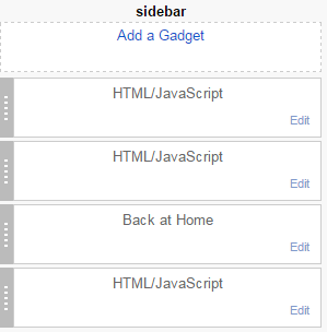
Each widget that you add to Layout has an edit link. If you hover your mouse cursor over it, your browser will show a tooltip at the bottom of your screen displaying important information related to that link. The information included in each link is:

gadget edit link

edit link info

  1. Blog ID : You can create up to 100 blogs in blogger. Each blog is identified using this ID.
  2. Widget Type: It's the Official name used for blogger widgets such as Header, Main, PopularPosts, Label etc.
  3. Widget ID
  4. Section ID

As shown in the second image above, the value next to widgetid is HTML3 which is the Gadget ID Code and the value next to sectionid is sidebar which is your Section ID code.

Section ID can easily be found now because recently blogger updated the Layout interface by highlighting in bold letters each section with its section ID Code.

blog posts section id

Sectionid is main in the above screenshot

sidebar section id

Sectionid is sidebar in the above screenshot

This method works for both Windows users and MAC users and is same for Safari/Opera/Firefox/Chrome browsers.

Finding Section and Widget ID - Method 2

This method could however work only for windows users because I am not user if Mac Safari browser does show URL for popup windows.

This time click the Edit link next to your widget, a popup window will open. Maximize it to see the Full URL in the address bar of the popup IFRAME.

popup url info


From the URL above you can see that the widgetid is HTML3 and sectionid is sidebar

That simple!

Locate Widgets in Blogger Templates

Now when you have learnt how to find the widgetid, its time to locate widgets inside your blogspot template. Suppose we wish to locate the widget with widgetid HTML3

locating widgets in blogger

1. Go to Blogger > Template > Click Edit HTML

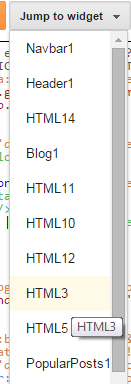
2. Click the drop down menu "Jump to widget"

3. The drop down menu contains a list widget IDs. In our case it is HTML3. Click it!

List of Widget IDs

4. You will be taken to the location where the HTML DOM for your widget exists enclosed inside <b:widget> tags.

Widget Code

You can expand this code and edit the Widget Contents like its Headline, style content hidden inside <data:content/> tag or do amazing things with it like hiding the Widget from rendering inside Mobile devices or hiding widget on a particular page or post.  

Need Help?

Let me know if you need further clarification on any method. I would love to make it more simple for you. Stay tuned and subscribe to our email news letter for more amazing stuff. Peace and blessings buddies! =d

Friday, 17 July 2015

Eid-ul-Fitr 2015 Mubarak To All Readers!

Eid Mubarak 2015

Ramadan kareem has finally reached its destination and as I am writing this post, we are preparing the Last iftar and surely this marks the end a Holy month which was full of spiritual contemplation and reflection. With the end of this Iftar the Gates to Satan will be opened once again. Eid-ul-Fitr is a reward for people who remain stead fast in their fasting and worship. This Eid is a gift from Allah to His believers for the hard labour and endeavors that they suffered by staying hungry and thirsty for hours. We would therefore like to include all of our beloved readers in this Eid festivity, and we'd like to wish you all a very happy Eid Mubarak on behalf of entire STCnetwork team!  Wishing you a blessed Eid filled with happiness and joy. May you guys have the best time with your friends and family. :)

May this Eid Brings you good tidings that lasts forever!


EID Mubarak Buddies!

Thursday, 16 July 2015

5 Ways to Improve Your Online Shop

5 ways to Optimize your online shopMost online retailers spend time updating their marketing tactics and developing new advertising campaigns, but no amount of marketing can help when your website isn�t optimized to create the best possible user experience. If your online store could use a boost in efficiency and appeal, give it a makeover with these tactics. I am sharing today 5 smart tips that will help you better optimize your online eCommerce site to turn every visitor into a returning customer

Design for Simplicity

Visitors should know the focus of your site within seconds of arriving at the homepage. Get rid of unnecessary text and design the layout around your main product or service. Avoid overwhelming visitors with too many choices. Use a large header image or a series of scrolling images to showcase current promotions and popular offerings.

design for simplicity

Category navigation should be simple and intuitive and require as few clicks as possible. Place a search box in a prominent place on every page to give customers the option of going directly to the products they�re looking for. Product descriptions should provide all necessary information in just a few descriptive sentences, offering only what the customer needs to know before they make a purchase. Make sure that �add to cart� buttons are visible both on product pages and in search results.

Provide Useful Filters

When customers perform a search on your site, the results can be overwhelming if there�s not a way to narrow down the results. Create sidebar filters with options such as category, brand, price and color to help people find exactly what they want. Place �breadcrumb� links at the top of every page so that customers can easily click back to a previous category when browsing or searching.

web search filters for online shopping

Your goal should make it as simple as possible for visitors to find the products that they came to your site to buy. The modern consumer doesn�t want to spend time sifting through page after page of results looking for one specific item. If that�s the only option that you offer, customers will leave without making purchases.

Make It Personal

Every search gives you the opportunity to customize the shopping experience for your visitors. You can use what people are searching for to track trends and see which products are getting the most attention. This same information can be applied to individual customers in the form of tailored product recommendations. Many sites display products similar to those that customers are viewing to give them an idea of what others with comparable interests are searching for and buying.

Customers also like being able to adjust settings in their accounts to receive personalized product recommendations either while they shop or via email. This directs them right to products they find useful or entertaining and can serve to increase sales by prompting them to make purchases they might not have considered before.

Step Up Style with Flipbooks

If you want to give your product catalog a little extra flair, consider designing a flipbook and embedding it in your site. Like a paper catalog, flipbooks include images and descriptions of products that users can browse at their leisure. However, flipbooks can feature links, audio and video along with static images to provide a much more dynamic experience.

designing a flipbook

The popularity of tablets means that the majority of your customers will look at your flipbook on a device other than a computer. This means that features of your website such as cart access and checkout buttons won�t be visible and could detract from your ability to make sales. However, many flipbook creation services allow you to embed these features directly into the catalog to let customers shop for products and make purchases without having to navigate to your main site.

An online PDF to Flipbook Converter is a great way to expand your reach beyond the scope of your website. Include social sharing links both on the page where the flipbook is featured and within the flipbook itself to encourage customers to share their favorite products with friends.

Streamline Your Checkout

streamline your checkoutEven customers that arrive on your site ready to make a purchase can get to the checkout and decide to abandon the process. This usually happens when the checkout is too long, too complicated or requires the input of too much information. If possible, pare your checkout process down to a single page. If you can�t use a one-page checkout, make sure that every page has a list of the steps at the top and that the current step is highlighted so that customers can see where they are in the process. This makes multi-step checkouts seem less arduous and encourages customers to proceed from one step to the next.
Another way to simplify checkout is to offer a guest option for those who don�t want to create a full account. This cuts down on the amount of clicks necessary to complete a purchase and decreases the likelihood that customers in a hurry will abandon their carts.

Need Help?

If you need more help and assistance in better optimizing your online shops, feel free to leave your comments below and we would love to share our experience with you. Do let us know how did you find these tactics and how far you think such minor changes could bring a drastic change in your business. Would love to hear from you guys. :)

Friday, 10 July 2015

Hide HTML in Mobile Devices For Blogspot without using 'Display:none' - [1]

Blogspot template with 100% Mobile User Experience

After Google's Mobile Friendly Update Algorithm which was rolled out on April 21, 2015. Many webmasters have seen a slight drop in their mobile traffic and they have now understood the importance of not just Mobile Friendly Web layouts but also templates that must load fast because mobile browsers are quite slow in rendering a webpage due to slow 3G or cellular network. Website Page Speed is an important Search engine metric to rank websites and it is really important that your Responsive and fluid layouts may serve content to visitors as fast as possible. Since People are new to creating Responsive Blogger templates, they often misuse some standards which can cause them a serious SEO blow in coming updates if not taken care of. One of such mistakes that I found on many freely available blogspot templates was the extensive use of CSS "Display:none" property for hiding Menu Links, Widgets and Columns. Read below to understand Why I believe use of Display:none is neither a good Design Approach and neither a SEO friendly method.

UPDATE: isMobileRequest  is applicable only to smartphone devices and it does not apply to tablets, iPads etc. Just a correction to this post. 

For The record: This tutorial is introducing Blogger Mobile Conditional Expressions first time across the web. The Data variable below is not even listed in official Blogger Layouts Data Tags.

Tutorial Series
3. Hiding Widgets & Scripts in Mobile Templates [1], [2]
7. Make Blog Sections Responsive: Header Widgets, Posts + Sidebar, Footer

Why not use Display:none; in Responsive Templates?

Display:none; property can surely be applied to images, widgets, iframes or any Div section with minimum textual content. You can not hide an entire Navigation Menu in Mobile template which you do display in Desktop template because you wish to instead display a responsive menu in Mobile devices. The menu will only be hidden from Front End view but its HTML will still be rendered and search robots will still crawl each link.  This can make robots suspicious and they can flag you for a Keyword stuffing activity.

More worse is the case when I see newbie designers hiding an entire content section with display:none. The content will still be visible to robots and they can penalize you for stuffing your page with unnecessary use of keywords.

Display:none also slows down the page because the  script or HTML that you have hidden from front end view using CSS will still load and render in background thus eating up your precious Page Speed.

In Short Display:none is a Front end approach we need one that hides the content at Server Side.

Use Blogger Conditional Expression For Mobile Devices

Blogger Templates are built with XHTML which support a long list of Conditional expressions and Logic Operators that can help you better communicate with the server and format the UI using widget layout tags. One Such Data Tag is isMobileRequest which is a Globally Available Data which can be applied to any HTML DOM inside the template. isMobileRequest  is a Boolean Data Type that accepts only two values which is either True or False.

Blogger adds a mobile parameter in Domain URL when the blog is visited using a Smartphone, Tablet, iPad or any mobile device. The mobile parameter works on a Boolean logic i.e. 0 or 1. If you visit mbt on a mobile device, you will see ?m=1 being appended to the URL in your address bar.

www.mybloggertricks.com/?m=1

m=1 means that the device is a mobile device and m=0 would mean a desktop or Laptop. However by default ?m=0 is not appended to the URL tail in Desktop devices.

?m=x is detected by isMobileRequest  which then tells the server that whether the device being used is a Mobile device or Desktop. We can use this request to hide or Show HTML content at server side which is not only just a SEO friendly approach but would also drastically improve your Mobile Page load time.

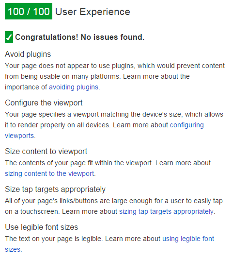
Google Has Given us a 100% Score for User Experience

This Magic Data Tag has helped us receive a 100/100 score on Google PageSpeed tool for MBT;

  • The pageSpeed score is however 63 because of too many Advertising banners on our site which we can not remove by any cost.

MBT has a 100% user Experience

How To Hide or Show HTML using isMobileRequest?

The Conditional expression has the following syntax which works on a Boolean Logic:

<b:if cond='data:blog.isMobileRequest == "true"'>

HTML To Show Only in Mobile Devices

</b:if>

The content inside the conditional expression above will load only in Mobile devices where the condition has value true due to the parameter ?m=1 where 1 means True.

If in case you wish to display a content only on desktop devices then you will reverse the logic in this order:

<b:if cond='data:blog.isMobileRequest == "false"'>

HTML To Show Only in Desktop Devices

</b:if>

As simple as that. Note that this condition works irrespective of whether or not you have enabled or disabled the default Blogger Mobile template. You can use it in both cases.

Need Help?

In Part#2 I will share in more detail on how to disable JavaScript and widgets in mobile themes using this logic. Stay tuned and do ask me as many questions as you may have. Peace and blessings buddies :)

Tuesday, 7 July 2015

Using OR, AND, NOT Logic Operators in Blogspot Template Layouts

blogspot template operatorsAre we are going to discuss electronics or logic gates here? Of course not! :) Blogger Team has recently made some performance based changes to their XHTML Widget tags for layouts. They have introduced some logic operators to simplify long conditional expression using short and simple syntax thanks to Blogger Logical Operators. I have been testing Blogger templates since 7 years and the best thing I loved about it is the simplicity to retrieve data from the server. Although users are restricted from accessing the server side and database records but they have been given a great deal of access to call objects on Front end using Layout tags.  Lets get straight to the fun ride!
For The Record: This is the first unofficial detailed tutorial of its kind across the web on Blogspot layout tags

List of Operators Supported by Blogger Templates

At present blogspot templates support all major operators used in basic programming which are:

Operator Syntax Definition
OR or and || OR or UNION is used to combine several conditions, any of which if true would render the HTML content. You can declare it either as or or ||.
Prevents repeating b:if tags
AND and and && And or INTERSECTION is used to combine two or more than two conditions. All conditionals must be true. You can use either and or the ampersand symbols &&.
Prevents repeating
b:if tags
NOT ! and not NOT or EXCLUSION is used when you want to exclude something from the condition. Use either not or !
Best used with Membership operator
Equivalence == and != Equity is used to to check what a data value is. Here '==' means equal to and '!=' means not equal to
Ternary Selector [condition] ? [result when true] : [result when false] Used to select one of two options, based on a condition.
Membership in and contains Used to check whether a value is one of several possible values. You can define the set using either square brackets [ ] or Curly braces { }.
Prevents repeating OR

Example Usage of These Operators

Below I will give brief examples of how smartly these operators simplify an expression and prevents repeating a condition.

OR Example

Suppose you wish to show a HTML code only inside index pages (search pages, homepage) and item pages (Posts) but not on Static pages or archive pages. This is how you will write down the conditional expressions using widget layout tags.

Previously without 'or' the expression was written as such:

<b:if cond='data:blog.pageType == "index"'>

<b:if cond='data:blog.pageType == "item"'>

HTML Code To render

</b:if>

</b:if>

Now with 'or' operator the expression is simplified as such:

<b:if cond='data:blog.pageType == "index" or data:blog.pageType == "item"'>

HTML Code To render

</b:if>

or you can use || instead of or:

<b:if cond='data:blog.pageType == "index" || data:blog.pageType == "item"'>

HTML Code To render

</b:if>

AND and Equivalence Example

Suppose you wish to show a HTML code only on Search pages but not on homepage. Here we are selecting label pages only out of index pages.

Previously without 'and' the expression was written as such:

<b:if cond='data:blog.pageType == "index"'>

<b:if cond='data:blog.url != data:blog.homepageUrl'>

HTML Code To render

</b:if>

</b:if>

Now with 'and' operator the expression is simplified as such:

<b:if cond='data:blog.pageType == "index" and data:blog.url != data:blog.homepageUrl'>

HTML Code To render

</b:if>

or you can use && like this

<b:if cond='data:blog.pageType == "index" && data:blog.url != data:blog.homepageUrl'>

HTML Code To render

</b:if>


You might be thinking what is the different between ! and != then lets try the next example to clear this confusion.

NOT and Membership Example

Unlike != which is only used when comparing/equating two tags, not (!) is used to negate an entire expression. not is mostly commonly used with Membership operator as shown below.

Lets suppose we wish to show a HTML code on all pages except the Posts and Static Pages. We will format our expression as shown below.

Previously without membership operator (contains or in) and NOT operator the expression was written as such:

<b:if cond='data:blog.pageType != "item"'>

<b:if cond='data:blog.pageType != "static_page"'>

HTML Code To render

</b:if>

</bi:f>

Now with NOT and membership operator the expression is simplified as such:

<b:if cond='data:blog.pageType not in {"item","static_page"}'>

HTML Code To render

</b:if>

you can also write it like this by placing not before the expression. Note that you can use either [] or {}, same meaning for membership operators.

<b:if cond='not data:blog.pageType in ["item","static_page"]'>

HTML Code To render

</b:if>

Or like this using contains:

<b:if cond='not ["item","static_page"] contains data:blog.pageType'>

HTML Code To render

</b:if>

Combined Use of OR and AND

You can surely make your expression even more in-depth by using OR and AND operator together in a single expression.

In the example below, the HTML code will render only when the page visited by user is either the archive page or Search/Label Page.


<b:if cond='data:blog.pageType == "archive" or (data:blog.pageType == "index" and data:blog.url != data:blog.homepageUrl)'>

HTML Code to render

</b:if>

You can group multiple conditions inside the round braces and then compare them as against others. As simple as that!

Ternary Selector Example

Ternary selector is most useful when you need to apply one class out of two classes to any HTML DOM.

In the example below we will use a ternary operator in a div tag to apply a class comments-open when comments are allowed and apply the class comments-closed when the page no more accepts comments

<div expr:class=�data:post.allowComments ? "comments-open" : "comments-closed"'>

HTML Code To render
</div>

This is an excellent way to show your readers a special message when you are no more accepting comments for certain posts.

Need Help?

In our coming tutorials we will make extensive use of these new operators to make sure you are served the most optimized blogger widgets and scripts. We have already started applying these new expressions in posts published last week. Do check how we used Ternary operators along with combined AND, OR and Equivalence operators in this post.

Let us know me know if you need any help or assistance in understanding any syntax. Peace and blessings buddies! :>

Saturday, 4 July 2015

Defining Device Breakpoints for Blogspot Templates

device breakpoints for blogspot blogs

With so many Mobile Products in market where each smartphone or tablet has a different Screen size, it is important that we select some Content Specific Breakpoints so that your blogspot page may adjust and fit perfectly to the different screen sizes and may not looked squeezed or poor in resolution. Google recently rolled out a Mobile Friendly update on April 21, 2015, which boosts the ranking of mobile-friendly sites on mobile search results.  Google no longer favors fixed width layouts and recommends that all sites must be made fluid and responsive, where text should be readable without tapping or zooming, tap targets are spaced appropriately and the page avoids unplayable content or horizontal scrolling.

Therefore follow this interesting tutorial series in order to make sure you keep receiving traffic to your blogspot blogs from mobile phones and receive a Mobile-Friendly Label from Google.

Tutorial Series
2. Common Device Breakpoints For a Responsive Blogspot Template
3. Hiding Widgets & Scripts in Mobile Templates [1], [2]
7. Make Blog Sections Responsive: Header Widgets, Posts + Sidebar, Footer

What are Breakpoints?

Breakpoints are points at which your layout design breaks or crashes. Breakpoints are CSS3 Media Queries that tells the browser which Layout to load for your website based on the screen size (viewport). It controls the display of your user interface (UI) on mobile devices.

Suppose your Navigation Menu may look fine on a Laptop or Tablet but it may look broken, horizontally scrolling the page on a small hand phone set containing a width less than 480px. The Menu tabs may look misaligned or out of position. This is the time when you will need to specify a different custom Layout using CSS styles for your menu for the breakpoint 480px so that your menu may look just fine on small screen sizes. The browser will load that Menu styles (layout) only when the screen size of the device is less than 480px.

Done with theory now lets start converting your Blogspot template into a Responsive Template!

Disable Blogger Default Mobile Template

Since we are designing a custom responsive template for your blog therefore we don't need the Default Mobile View templates offered by blogger. It is important to disable it else you will not be able to see the custom mobile changes we will make in this tutorial series.

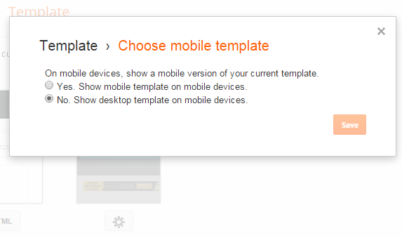
1 Go To Blogger > Template

2 Click the Gear Icon

3 Choose "No, Show desktop template on mobile devices"

disable mobile template in blogger


4 Click Save

5 Next Click Edit HTML and search for this code if in case it exists in your template else ignore this step and follow step#6.

<b:if cond='data:blog.isMobile'> <meta content='width=device-width,initial-scale=1.0,minimum-scale=1.0,maximum-scale=1.0' name='viewport'/> <b:else/> <meta content='width=1100' name='viewport'/> </b:if>

Delete the code above if you found it.

6 Paste the following meta viewport code just below <head>

<meta content='width=device-width, initial-scale=1, maximum-scale=1' name='viewport'/>

The code above gives information to the web browser about the screen size of the mobile device.

7 Save your template

Mobile Friendly Breakpoints For Blogspot blogs

Choosing the right breakpoints for any platform is the most complex task but it can be made quite easy if you apply the rule of KISS to it i.e. Keep it Simple Stupid!

We have defined below some of the most common Content Specific Device Breakpoints for blogspot blogs which respond quickly to changes in viewport. We will term it as the Responsive Cheat Sheet.

Note that we have used CSS3 Media Queries by Keeping Apple Devices as standard for simplicity but the breakpoints below cover all major brands like Samsung, Black berry, Nokia, Windows Phone, Kindle, Nexus and so on.

1 Go To Blogger > Template > Backup your template

2 Click Edit HTML

3 Search for  ]]></b:skin>  and paste the following CSS Code just below it:

<style>

/* ########  Responsive Cheat Sheet ########### */

/*-----iPhone 2G, 3G, 4, 4S Portrait View ZONE1 ----------*/

@media only screen and (max-width:320px) {

}

/*-----iPhone 2G, 3G, 4, 4S Landscape View ZONE2 ----------*/

@media only screen and (max-width:480px) {

}

/*-----iPhone 5,6 ZONE3 ----------*/

@media only screen and (max-width:568px) {

}

/*-----iPads, Tablets ZONE4 ----------*/

@media only screen and (max-width:768px) {

}

</style>

4 Save your template and you are almost done!

The above are the only breakpoints required to make any blogger template responsive. You don't need combined or separate breakpoints for landscape and portrait view. The above Cheat Sheet is enough to make everything work just fine!

How these breakpoints work?

The yellow highlighted regions above are viewport sizes that defines the CSS Styles for a particular screen size. The CSS styles for each screen size will be defined inside these viewports.

By max-width:480px we mean width less than or equal to 480px. Styles inside this breakpoint will load only when the screen size is less than or equal to 480px.

For example If you wish the Sidebar Column which has a CSS Class .sidebar and width 300px, to have a 100% width in a Mobile Phone then you will add its new width inside ZONE1 breakpoint (inside the curly braces) as shown below

/*-----iPhone 2G, 3G, 4, 4S Portrait View ZONE1 ----------*/

@media only screen and (max-width:320px) {

.sidebar {width:100%; overflow:hidden;}

}

That simple!

Note that none of the codes above will make your blog mobile friendly yet. The above guide is the skeleton/basic structure for a responsive layout. Your blog template will be fluid once you cover and follow all parts of this tutorial series.

Need Help?

Let us know if you need further clarification on any concept. I would love to answer all your questions posted in the comment form below. A lot more interesting parts are on its way. In our coming tutorials we will learn in detail how to insert the new responsive styles correctly inside the breakpoints specified above for different components/widgets of your blog. Make sure to Subscribe to our Email newsletter to ensure you don't miss any update.

Peace and blessings buddies! =)

Design a Responsive Blogger Template - Tutorial

Design Responsive Blogger TemplateDesigning Mobile Responsive Templates has become a trending topic in web today. Mobile Technology and Mobile Traffic has evolved immensely from 2010 to 2013 especially in Asia USA and Africa. People now prefer reading emails on their iPhone as compared to using their Desktop computer. Fast wireless wifi connections is another reason that encouraged usage of mobile devices like smart phones (Apple and Android), Tablets, netbooks and low resolution cellphones like NOKIA.

More of our clients today are interested in fluid and flexible Blogger templates compared to traditional Fixed width Layouts. We have received over a hundred requests for this tutorial series. We are therefore releasing the first ever complete step by step Tutorial Guide on Mobile Optimized Responsive Blogger Templates to the Google Blogger Community. You will learn how to enable your Blog layout adjust itself automatically to the Device Screen Size.

Tutorial Series
1. Design a Responsive Blogger Template
3. Hiding Widgets & Scripts in Mobile Templates [1], [2]
7. Make Blog Sections Responsive: Header Widgets, Posts + Sidebar, Footer

Note: You are reading Part 1. Read it only for understanding the theory behind what Mobile friendly blogspot templates are. We will do the coding part from Part 2 onwards which is Common Device Breakpoints.

What is a Responsive Layout?

In layman terms a responsive webpage is a flexible design that adjusts its width and styles according to user device Screen size. It will look different on a Desktop Screen and much different on a smart phone or Tablet (has two sizes: portrait and landscape) . No matter what device you use a responsive design will adjust itself perfectly to give you a Clean user interface.

For Blogspot Users:

If you have activated Mobile view for your blogger blogs then if you view your blog in a smart phone, you will find its look completely different compared to a desktop. By default all blogger blogs are made mobile optimized but those styles are too simple and doesn't represent the blog in its true form therefore we will learn to create a custom designed Mobile Friendly layout for Blogger ourselves. This will allow you to customize your mobile Template and have a better control over the display of elements such as Ads and widgets on your site.

Therefore in our case we don't need the default mobile view at all and we have disabled it completely.

Mobile view Disabled in Blogspot

See it yourself!

An example of a responsive website is the latest design of MyBloggerTricks.com. Just view it using this amazing tool linked below. Observe clearly how its Menu changes as the size of the screen shrinks. You can also test it by simply adjusting your browser window size using your mouse cursor!

MBT view in iPhone

Just insert the following URL in the Input Field

http://mybloggertricks.com?m=1

Testing Responsive Designs

Are you too late?

If your blog layout doesn't support auto adjustment of layout and loading of new stylesheets based on Device width then you don't need to worry because Responsive layouts is a new idea and it will take time till everyone applies it. You wont believe this but Giant Corporate sites like TechCrunch have not yet upgraded their theme to a responsive one and moreover Google is so slow that it has not even introduced auto-width-adjusting AdSense Ads for such fluid layouts.  So it will take time till this new terminology is well acknowledged by majority of websites and internet firms.

Update: TechCrunch is now responsive and Google now favors Mobile friendly Pages. Google now ranks Mobile friendly blogs better and give them preference in Mobile search results over sites which are not yet mobile optimized. So hurry up and save that precious mobile traffic which you might be loosing at this moment!

How are Responsive Layouts Designed?

If you know some basics of HTML and CSS then trust me you are going to find it extremely easy and you would love to play with your layout columns using just your browser. CSS3 has introduced several new techniques of achieving some frequently used functions. It is no more limited to just styles but it now supports some really interesting front-end programming functions like @import, counter-reset, animations, transitions etc. and the most popular amongst them are Media Queries (@media ) that acts like conditional IF statements used in blogger.

Normally mobile browsers emulates a desktop view by squeezing big resolutions into small screens that is often difficult to read and browse. You must be familiar that how difficult it is to click a web link in iphone unless you zoom it.. In order to tell the browser to detect the screensize we will add a META viewport tag inside <head> section of your layout.
 

Any Template can be converted into a flexible layout in just two simple steps:

1. Add Meta Viewport just below <head> tag

<meta name="viewport" content="width=device-width, initial-scale=1, maximum-scale=1"/>

Here width=device-width will detect the screen size.

2. Use CSS3 Media Queries

Update: Ignore the Breakpoints below and instead follow our detailed tutorial on Defining Device Breakpoints  discussed in Part 2 

Media Queries are conditional CSS3 queries that detects screen size and applies the relevant stylesheet to that screen. For example see these two media queries for smart phones and Tablet devices.

@media screen and (max-width : 480px) {

/* If screen size less than 480px Load these styles */

/* Done for Smart Phones */

}

@media screen and (max-width : 768px) {

/* If screen size less than 768px Load these styles */

/* Done for Tablets */

}

Here are some interesting tips that you keep in mind throughout this tutorial series:

Tips To remember:

  1. Use percentages instead of numeric values to define width of columns
  2. Create Separate Style sheets for Three Major Breakpoints  320/480/768
  3. Remember to use box-sizing, max-width and min-width properties

Need help?

This was a brief introduction of how exactly a responsive layout is designed and what makes responsive websites so important today. I just hope I did justice with the post by making it as easy as possible. Please be aware that responsive web design requires a significant amount of testing to make sure your site looks good on all devices and browsers, you may want to look into a variety of test management tools in order to expedite the process. If you are facing confusion in any part just feel confident to leave your precious comment in the comment box below and I will be at your service 24/7. Please let me know how useful was this tutorial for you and did it help answering most of your questions?

Wish you peace and blessings buddies :)