Tuesday, 12 May 2015

Image Shortcode - Embed Images in Blogger Comments!

Image Shortcode for bloggerImage Shortcode lets you insert images anywhere on your blogger blog with a simple one line textual code. You can now embed images with links or without links inside blogger comments form, posts, pages, HTML/JavaScript widgets almost anywhere! You can customize the width and height of your image, link the image to a URL, add nofollow attribute to the URL or simply insert the image in its actual resolution with a simple code. You may use the images to link any page or post inside your website, or use it to link an external page. Blogger Shortcode plugin has revolutionized BlogSpot blogs and it is the biggest development so far Alhamdulillah after the JSON API.  Just like you insert images in bulletin boards or forum threads, you can now embed images in blogger comments box and the shortcode will render it perfectly. Lets see it in action!

Interesting: It's the first shortcode which we implemented on MBT too. You can test it with [img/] shortcode

1. Install Blogger Shortcode Plugin

In order to use Image shortcode you must first install the shortcode plugin for your blogger blog by following 7 easy steps shared on the link below:

Skip installing it if you have already added it in your blogspot template

2. Start Inserting Images using Image Shortcode!

Now when you wish to insert images in original resolution simply use the shortcode below. Paste it anywhere you like and the image will be perfectly displayed.

[image src="IMAGE LINK"/]

  • Replace IMAGE LINK with the Image Link where it is hosted

If you wish to link the image to a post, page or external website then add the Image URL attribute in this format

[image url="URL HERE"  src="IMAGE"/]

  • Replace URL HERE with the URL of the page, post or site you wish to link to

If you wish to nofollow the link to what the image points then add the nofollow attribute in this format

[image rel="nofollow" url="URL HERE" src="IMAGE"/]


Example Of Image Shortcode

Now lets suppose I want to embed an image on a post. I want its width to be 500px and its height to be 260px, I want it to link to http://blogger-shortcode.blogspot.com/ and I want this link to be a nofollow because I don't want to pass precious PageRank juice to it. The image is located at http://ask.mybloggertricks.com/uploads/default/767/77f624bc8120838b.png

The shortcode will be

[image width="500px" height="260px" rel="nofollow" url="http://blogger-shortcode.blogspot.com" src="http://ask.mybloggertricks.com/uploads/default/767/77f624bc8120838b.png"/]

Output

Blogger shortcodes

That simple!

Complete list of shortcodes

Attribute Definition
src Insert Image Link here where it is hosted
url Insert the URL where the image will point. You can point the image to a post on your blog, page or any external site.
width Adjusts the width of the image. Can be defined in pixels or percentages.
height Adjusts the height in pixels or percentage
nofollow A SEO Friendly option that lets you mention whether you want to nofollow the link or not.

Need Help?

You can contact us 24/7 for any help on our forum or you can post your queries below in the comment box to ask for any assistance needed. I hope the image shortcode may bring a positive change in your blogging hobby and may help you better express your thoughts with your readers through images. Subscribe and stay tuned because a lot more has to come! Peace and blessings buddies. =)

Sunday, 10 May 2015

Buttons Shortcode - Create CSS3 Buttons in Blogger!

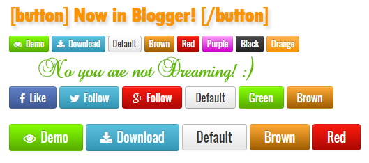
Buttons Shortcode for bloggerButtons shortcode is another exciting element of Blogger Shortcode Plugin which is a one line textual code that you can insert anywhere on your blogger blog to display colorful buttons with links and icons. You can add fontAwesome icons and links to your buttons and choose any gradient background color you want! You can also create clickable social media sharing buttons or follow buttons. The buttons come in three sizes, small, medium and large. You can also decide when to nofollow a link in the button. The buttons can be added inside blog posts, comments and sidebar widgets, almost anywhere. The buttons are design Compatible with all major browsers and of course responsive. Lets see them in action!


1. Install Blogger Shortcode Plugin

In order to use Buttons shortcode you must first install the shortcode plugin for your blogger blog by following 7 easy steps shared on the link below:

Skip installing it if you have already added it in your blogspot template

2. Add Button Color Themes

By default I have created 9 Color themes for the button shortcode using CSS3 gradient backgrounds. Lets first add these styles inside your template.

1 Go To Blogger > Template > Backup your Template

2 Click Edit HTML

3 Search for this code ]]></b:skin>

4 Just above it paste the following CSS code

/*-------Buttons Shortcode---------------- */

    a.sc-button i{padding-right:3px}a.sc-button.large{padding:8px 20px;font-size:18px}a.sc-button.medium{padding:5px 14px;font-size:15px}a.sc-button.small{padding:1px 6px;font-size:12px}a.sc-button{padding:4px 14px;margin-bottom:0;font-size:14px;display:inline-block;line-height:20px;text-align:center;vertical-align:middle;cursor:pointer;color:#333;text-shadow:0 1px 1px rgba(255,255,255,0.75);background-color:#f5f5f5;background-image:-moz-linear-gradient(top,#fff,#e6e6e6);background-image:-webkit-gradient(linear,0 0,0 100%,from(#fff),to(#e6e6e6));background-image:-webkit-linear-gradient(top,#fff,#e6e6e6);background-image:-o-linear-gradient(top,#fff,#e6e6e6);background-image:linear-gradient(to bottom,#fff,#e6e6e6);background-repeat:repeat-x;filter:progid:DXImageTransform.Microsoft.gradient(startColorstr='#ffffffff',endColorstr='#ffe5e5e5',GradientType=0);border-color:#e6e6e6 #e6e6e6 #bfbfbf;border-color:rgba(0,0,0,0.1) rgba(0,0,0,0.1) rgba(0,0,0,0.25);border:1px solid #bbb;border-bottom-color:#a2a2a2;-webkit-border-radius:4px;-moz-border-radius:4px;border-radius:4px;-webkit-box-shadow:inset 0 1px 0 rgba(255,255,255,.2),0 1px 2px rgba(0,0,0,.05);-moz-box-shadow:inset 0 1px 0 rgba(255,255,255,.2),0 1px 2px rgba(0,0,0,.05);box-shadow:inset 0 1px 0 rgba(255,255,255,.2),0 1px 2px rgba(0,0,0,.05);text-decoration:none;font-family:oswald}a.sc-button:hover{color:#333;text-decoration:none;background-color:#e6e6e6;background-position:0 -15px;-webkit-transition:background-position .3s linear;-moz-transition:background-position .3s linear;-o-transition:background-position .3s linear;transition:background-position .3s linear}a.sc-button.green{color:#fff;text-shadow:0 -1px 0 rgba(0,0,0,0.25);background-color:#84FF00;background-image:-moz-linear-gradient(top,#84FF00,#58AA00);background-image:-webkit-gradient(linear,0 0,0 100%,from(#a7be2c),to(#95aa27));background-image:-webkit-linear-gradient(top,#84FF00,#58AA00);background-image:-o-linear-gradient(top,#84FF00,#58AA00);background-image:linear-gradient(to bottom,#84FF00,#58AA00);background-repeat:repeat-x;filter:progid:DXImageTransform.Microsoft.gradient(startColorstr='#84FF00',endColorstr='#58AA00',GradientType=0);border-color:#95aa27 #95aa27 #5e6c19;border-color:rgba(0,0,0,0.1) rgba(0,0,0,0.1) rgba(0,0,0,0.25)}a.sc-button.green:hover{background-color:#58AA00}a.sc-button.blue{color:#fff;text-shadow:0 -1px 0 rgba(0,0,0,0.25);background-color:#49afcd;background-image:-moz-linear-gradient(top,#5bc0de,#2f96b4);background-image:-webkit-gradient(linear,0 0,0 100%,from(#5bc0de),to(#2f96b4));background-image:-webkit-linear-gradient(top,#5bc0de,#2f96b4);background-image:-o-linear-gradient(top,#5bc0de,#2f96b4);background-image:linear-gradient(to bottom,#5bc0de,#2f96b4);background-repeat:repeat-x;filter:progid:DXImageTransform.Microsoft.gradient(startColorstr='#ff5bc0de',endColorstr='#ff2f96b4',GradientType=0);border-color:#2f96b4 #2f96b4 #1f6377;border-color:rgba(0,0,0,0.1) rgba(0,0,0,0.1) rgba(0,0,0,0.25)}a.sc-button.blue:hover{background-color:#2f96b4}a.sc-button.purple{color:#fff;text-shadow:0 -1px 0 rgba(0,0,0,0.25);background-color:#FD9CF8;background-image:-moz-linear-gradient(top,#FD9CF8,#CE00CF);background-image:-webkit-gradient(linear,0 0,0 100%,from(#5bc0de),to(#2f96b4));background-image:-webkit-linear-gradient(top,#FD9CF8,#CE00CF);background-image:-o-linear-gradient(top,#FD9CF8,#CE00CF);background-image:linear-gradient(to bottom,#FD9CF8,#CE00CF);background-repeat:repeat-x;filter:progid:DXImageTransform.Microsoft.gradient(startColorstr='#FD9CF8',endColorstr='#CE00CF',GradientType=0);border-color:#CE00CF #CE00CF #FD9CF8;border-color:rgba(0,0,0,0.1) rgba(0,0,0,0.1) rgba(0,0,0,0.25)}a.sc-button.purple:hover{background-color:#CE00CF}a.sc-button.orange{color:#fff;text-shadow:0 -1px 0 rgba(0,0,0,0.25);background-color:#faa732;background-image:-moz-linear-gradient(top,#fbb450,#f89406);background-image:-webkit-gradient(linear,0 0,0 100%,from(#fbb450),to(#f89406));background-image:-webkit-linear-gradient(top,#fbb450,#f89406);background-image:-o-linear-gradient(top,#fbb450,#f89406);background-image:linear-gradient(to bottom,#fbb450,#f89406);background-repeat:repeat-x;filter:progid:DXImageTransform.Microsoft.gradient(startColorstr='#fffab44f',endColorstr='#fff89406',GradientType=0);border-color:#f89406 #f89406 #ad6704;border-color:rgba(0,0,0,0.1) rgba(0,0,0,0.1) rgba(0,0,0,0.25)}a.sc-button.orange:hover{background-color:#f89406}a.sc-button.red{color:#fff;text-shadow:0 -1px 0 rgba(0,0,0,0.25);background-color:#FE1A0E;background-image:-moz-linear-gradient(top,#FE1A0E,#AC0905);background-image:-webkit-gradient(linear,0 0,0 100%,from(#FE1A0E),to(#AC0905));background-image:-webkit-linear-gradient(top,#FE1A0E,#AC0905);background-image:-o-linear-gradient(top,#FE1A0E,#AC0905);background-image:linear-gradient(to bottom,#FE1A0E,#AC0905);background-repeat:repeat-x;filter:progid:DXImageTransform.Microsoft.gradient(startColorstr='#FE1A0E',endColorstr='#AC0905',GradientType=0);border-color:#bd362f #bd362f #802420;border-color:rgba(0,0,0,0.1) rgba(0,0,0,0.1) rgba(0,0,0,0.25)}a.sc-button.red:hover{background-color:#AC0905}a.sc-button.black{color:#fff;text-shadow:0 -1px 0 rgba(0,0,0,0.25);background-color:#363636;background-image:-moz-linear-gradient(top,#444,#222);background-image:-webkit-gradient(linear,0 0,0 100%,from(#444),to(#222));background-image:-webkit-linear-gradient(top,#444,#222);background-image:-o-linear-gradient(top,#444,#222);background-image:linear-gradient(to bottom,#444,#222);background-repeat:repeat-x;filter:progid:DXImageTransform.Microsoft.gradient(startColorstr='#ff444444',endColorstr='#ff222222',GradientType=0);border-color:#222 #222 #000;border-color:rgba(0,0,0,0.1) rgba(0,0,0,0.1) rgba(0,0,0,0.25)}a.sc-button.black:hover{background-color:#222}
    a.sc-button.brown{color:#fff;text-shadow:0 -1px 0 rgba(0,0,0,0.25);background-color:#FEAA33;background-image:-moz-linear-gradient(top,#FEAA33,#9F5E02);background-image:-webkit-gradient(linear,0 0,0 100%,from(#FEAA33),to(#9F5E02));background-image:-webkit-linear-gradient(top,#FEAA33,#9F5E02);background-image:-o-linear-gradient(top,#FEAA33,#9F5E02);background-image:linear-gradient(to bottom,#FEAA33,#9F5E02);background-repeat:repeat-x;filter:progid:DXImageTransform.Microsoft.gradient(startColorstr='#FEAA33',endColorstr='#9F5E02',GradientType=0);border-color:#9F5E02 #9F5E02 #FEAA33;border-color:rgba(0,0,0,0.1) rgba(0,0,0,0.1) rgba(0,0,0,0.25)}a.sc-button.brown:hover{background-color:#9F5E02}
a.sc-button.fb{color:#fff;text-shadow:0 -1px 0 rgba(0,0,0,0.25);background-color:#6080C6;background-image:-moz-linear-gradient(top,#6080C6,#3a5795);background-image:-webkit-gradient(linear,0 0,0 100%,from(#6080C6),to(#3a5795));background-image:-webkit-linear-gradient(top,#6080C6,#3a5795);background-image:-o-linear-gradient(top,#6080C6,#3a5795);background-image:linear-gradient(to bottom,#6080C6,#3a5795);background-repeat:repeat-x;filter:progid:DXImageTransform.Microsoft.gradient(startColorstr='#6080C6',endColorstr='#3a5795',GradientType=0);border-color:#3a5795 #3a5795 #6080C6;border-color:rgba(0,0,0,0.1) rgba(0,0,0,0.1) rgba(0,0,0,0.25)}a.sc-button.fb:hover{background-color:#3a5795}


5 Save your template and you are all done with template editing!

You can add a theme of your choice too if you wish. Do ask us on our forum if you wish to create a button with your custom color choice.

3. Finally Start Adding Buttons using a Shortcode!

To add a button inside your post, comments or sidebar HTML/JavaScript widgets, use the shortcode below

[button]Your Title[/button]

OUTPUT:

default button 

Customize the Button!

Following is the complete list of attributes supported by Buttons Shortcode

Attribute Definition
src Insert button URL/Link here
color Mentions Button Color. Options: red, brown, blue, green, purple, black, orange, fb
size Adjusts the size of the button. Options: small, medium, large 
rel Decides whether to add a nofollow to a link or not


Now lets suppose you want to create a Download button with a Download icon, blue background and large size. Then you will use attributes inside shortcode in the following format.

[button size="large" color="blue" src="http://www.example.com"]
<i class="fa fa-download"></i> Download
[/button]

OUTPUT:

Download button shortcode

  • Insert download link inside the src attribute. Replace http://www.example.com with your URL.
  • Replace fa-download with your FontAwesome Icon class.

That simple! :)

Nofollow the Buttons!

Another exciting update we made to this button today (12th May 2015) is the option to decide whether you want to add a nofollow link attribute to the button or not. You may want to nofollow demo buttons and social media buttons and for that we have created for you the option to decide whether you want to flow your PageRank juice to a particle link or not. Whenever you want to tell robots that you are linking a site but you are not recommending it and neither you wish to pass your precious PR juice to it through a backlink, then simply add the rel attribute in the shortcode in this format:

[button rel="nofollow" src="http://www.example.com"]DEMO[/button]

If incase you want to recommend the link and pass your PR juice to it then simply don't bother adding any rel attribute.

Need Help?

Let us know if you need any further help. I hope this shortcode helps you add a new life to your blog and helps you add colorful buttons without worrying about adding complex piece of codes, just add install the blogger shortcode plugin on your blog and benefit from dozens of exciting web tools and widgets. Peace and blessings buddies! =>

Sunday, 3 May 2015

First Steps To Recovering From Google's Mobilegeddon


Mobilegeddon is the nickname give to Google's latest mobile-friendly search algorithm that promised to uproot rankings for websites that weren't mobile-friendly. But in reality, it�s not quite as potent. We recently discussed the effects of this algorithm thus far on websites, and they have not been catastrophic as Google has threatened. However, a lot of websites did get hit. Let's talk about how to take the first steps towards recovering from this penalty.


Mobilegeddon is the next big thing in Google algorithm updates. Unlikes Panda, Penguin, Pigeon, Hummingbird and the other algorithms, you might have noticed it�s not an animal name. This is because the people who name things aren�t really consistent or original. Don�t worry about it.


This particular update, as the moniker implies, deals heavily with mobile SEO. Specifically, it makes �being mobile-friendly� a ranking factor. If your site is mobile friendly, congratulations; you�re perfectly safe. If your site isn�t mobile-friendly, you�ll be hit by the penalty, which might be pretty bad depending on how far from mobile friendly you are.


What does Mobile Friendly Mean?


Google has a list of mobile guidelines, but they can all be summarized fairly easily.


  • Avoid anything that doesn�t work on mobile. This means Flash, primarily, though it also includes custom code and JavaScript that doesn�t render properly.

  • Use text that�s properly sized for small devices. If the user has to zoom in just to read your site, it�s not going to be very useful to them, and they�ll find another resource.

  • The same goes for other content. Make sure everything fits on the screen. If the user has to scroll horizontally, you�re going to earn a penalty.

  • Make sure your links and navigation are spaced out and easy to use. The user should never be able to �fat finger� the wrong link because two are too close together.


If you want to test to see if your site is mobile friendly, you can use Google�s testing tool.


Fixing a Mobile Penalty


Step 1: Figure out how bad the hit to your traffic was. The Mobilegeddon update rolls out over the course of a week, so choose a 2-week period both before and after the date to get an idea of your traffic. Use whatever analytics program you want, though Google Analytics is probably the best for diagnosing a Google penalty. If your traffic wasn�t actually hit all that hard, you can get away with taking your time on a mobile update. Of course, you�ve had plenty of time already.


Step 2: Determine the scale of the changes you need to make. This is a pretty complex step, and step three will depend on what you determine here.


Step 3: Implement whatever level of fix you need to. This might mean tweaking your existing site, or it might mean implementing an entirely new responsive redesign. How quickly you need it, and how harshly it hurts you to not have it, depends on how badly you were hit. If you�re using WordPress, WP Touch Pro is an easy solution.


At the smallest level, use tools like Google�s pagespeed ranking to see if your site is fine, but just a little slow. Sometimes you�ll see a drop in traffic because your mobile site is a little slow, but there�s nothing technically wrong with it. Just work to speed up your side by making code a little more streamlined, maybe cutting a bit of the heavier multimedia content, that sort of thing.


A step up the chain, maybe you have a mobile site but it breaks several of Google�s best practices. Maybe you have too many links and they�re too close together. If your links are hard to tap accurately, you�ll be penalized. Remove or space out your links. The same goes for too-small fonts or multimedia content that doesn�t load. You can�t force iPhone users to view a Flash site, and Google will penalize you for it.


At almost the top level, you have the lack of a mobile site at all. Maybe users can use your desktop site via a phone through liberal use of zoom and magnification tools, but at least it functions. You�ll be penalized pretty hard for this, but the most necessary visitors can still use your site. Take the time to develop a responsive redesign, and hurry to implement it, but make sure it works before you throw up some hastily and shoddily coded substitute.


The absolute top level is when you have a no mobile site at all, and your desktop site doesn�t work for mobile devices. This might be because it�s too small or hidden behind code a mobile device can�t parse. This also affects heavily Flash-based sites. If this is the case, you might as well be completely deindexed from the mobile search results. You have some serious work to do to get your traffic back, though to be fair, you probably didn�t have anything other than bounces from mobile sources to begin with.

Friday, 1 May 2015

What Is The Best Way To Optimize Webpage URLs?


Optimize URL structure


Website URL structure is an important part of SEO that is underestimated by many. Beyond putting keywords into the URL, many don't give it second thought. And yet, it is one of the simplest and most important things to optimize, and plays an important part in search results. Today, we will discuss some URL optimization techniques to improve your websites' rankings.


When talking about URL structures, a few things come to mind, namely the URL length, keywords, sub-directories, special characters, and the effect of each of them on direct traffic as well as search visibility. Let's start with the simplest of them all.


URL Length


The URL length isn't a game changer in search rankings, but it still is an important factor. Not to say that long URLs don't rank well - they can because it ultimately boils down to the content. But on average, the dominating search results mostly average between 35-40 characters.


Not only that, the URL length is a major contributor when it comes to direct traffic - i.e. people who come over by typing the URL into their browsers. The shorter the URL, the easier it is to remember.


Sub-directories


URLs often contain many sub-directories/sub-folders. This very page you are on contains two. 2015/ and 05/. As far as hierarchies go, it is OK to have as few as you want, or as many as you can manage. There is no co-relation between the number of sub-directories and search rankings. However, there are a few things to keep in mind.


Generally, from the user-friendliness aspect, it is considered as a good practice to keep it simple. It accounts for more direct traffic. Also, it is advisable to keep numbers out of URLs, and generally go with easy to read words. For blog posts, you can either use a dated structure such as site.com/2015/05/article.html, or category structure such as site.com/how-to/article.html. Personally, I prefer the latter, but you can go either way.


Also, make sure that the images you upload are named properly, so that when opened, their URL is readable and looks decent.


Keywords


Having a keyword within your domain name and URL is a declining factor in rankings. It is becoming less important over time since Google is placing more emphasis on other search factors. When you create URLs within your site, don�t worry about making them keyword rich. It doesn�t hurt to add keywords if it makes sense, but you shouldn't stuff your URLs with keywords, or they will seem unnatural.


Special Characters


Sometimes you see strange characters in URLs such as  &, %, $, and @. It is more difficult for search engines to crawl websites if their URLs contain a lot of these special characters. Consider the fact that Google has gone on record to state that you should be using dashes over underscores because it affects how their search engine reads the keywords in your URL. This is how seriously you should take these special characters. According to an estimate by Neil Patel, only about 0.2% of high ranking URLs have special characters in them.


If you are using images, don't let spaces come in when you name them. "autumn-sunset" is better than "autumn sunset" because the space gets replaced by special characters.


Long story short, optimizing your URLs can't hurt your rankings. However, don't focus too much of your marketing efforts on your URL structure because it doesn�t impact rankings as much as backlinks or content quality. It is just there to give you a small edge, so might as well avail it when you can.


Tuesday, 28 April 2015

How Has Google's Mobile Friendly Update Affected Websites?


Mobilegeddon


Last week, Google started rolling out a new mobile friendly update to its mobile search algorithm. This was aimed at significantly changing the mobile search results to give preference to mobile ready web sites over non mobile ready ones. Experts jokingly termed it 'Mobilegeddon', because all signs indicated that it is a major change in many years, and will significantly impact websites. But a week after the launch, has it really been such a significant update?


Thus far, the algorithm doesn't seem to have had as big of an impact as we expected.


Google confirmed in the Webmaster Central blog that the roll out began on Tuesday, April 21st. Some experts started seeing a difference as early as the 22nd. Some websites such as SEJ even published a list of top winners and losers from this mobile friendly update.


Mobilegeddon


However, in many cases, these changes were merely slight disturbances, and not very significant shifts. Several SEO metric companies such as Searchmetrics are tracking the update and for the most part, they are not seeing huge shifts in the Google mobile ranking algorithm just yet.


This is not to say that websites haven't been affected. Quite the contrary. Some websites certainly seem to be losing and some taking advantage. But compared to overall search volume for major keywords, the change isn't huge. However, Google has said that the roll out can last a week more yet. So maybe we just need to wait a little longer.


According to Moz, "so far, the big day was April 22nd, and it wasn't that big." Peter Meyers from Moz has been tracking mobile search results rankings for a set of top keywords, and according to him, the punch of the update hasn't fallen, not as yet anyway.


MozCast
Credits: Moz Blog


Some experts reckon that Mobilegeddon is here. According to Searchmetrics, 'visible trends can be seen in the new data'. But for the most part, the webmaster community hasn�t been too impressed with the level of significance in the mobile results. Ryan Heuser from seoClarity noted a variance of only 5.1% in Google mobile search results.


This means that most are not noticing significant changes to the mobile search rankings yet. Again, that might change over the course of the next week. With that said, there is still time to make your site mobile friend. Follow the article below to get started on that.


Good luck :)

Saturday, 25 April 2015

Major WordPress Plugins Making Websites Vulnerable


Vulnerable WordPress Plugins


Are you using WordPress to run one of your websites? If yes, then you need to read through. According to a latest warning by a security company, a number of WordPress plugins are vulnerable to a security flaw, which could compromise your website and leave it open for malicious attacks. These are some of the major plugins that you are likely to have installed on your websites. If so, then immediate action is required!


The warning was issued by WordPress Security watchdogs Sucuri. According to them, this is a major security flaw that is shared by many WordPress plugins, some of which are quite popular. According to them;


�Cross-site Scripting (XSS) due to the misuse of the add_query_arg() and remove_query_arg() functions. These are popular functions used by developers to modify and add query strings to URLs within WordPress.�


Apparently, the problem was that the official WordPress Official Documentation for these functions was not very clear, which led to many plugin developers using them in an insecure way.


To date, this is the list of affected plugins:


  • Jetpack

  • WordPress SEO

  • Google Analytics by Yoast

  • All In one SEO

  • Gravity Forms

  • Multiple Plugins from Easy Digital Downloads

  • UpdraftPlus

  • WP-E-Commerce

  • WPTouch

  • Download Monitor

  • Related Posts for WordPress

  • My Calendar

  • P3 Profiler

  • Give

  • Multiple iThemes products including Builder and Exchange

  • Broken-Link-Checker

  • Ninja Forms


As you can see, some of these plugins are very popular and used by millions of websites. If you use any of the above plugins, it�s recommended that you update them immediately.


This vulnerability was initially discovered last week, which has allowed for time for the flaws to be patched. Sucuri reports that all plugins have been patched, and as of this morning updates should be available to all users.


As an additional caution, plugins beyond what�s listed above may be vulnerable to the same security flaw, and have just not been detected yet. With that in mind, it�s best to keep all of your plugins updated just in case.


Stay safe :)


Tuesday, 21 April 2015

How To Optimize Content For Google's Mobile Algorithm Update?


Google's mobile algorithm update


What is the biggest algorithm update Google has made over the last decade? For most of us, Google Panda and Penguin immediately spring to mind. Right? Wrong! The biggest and most notable change Google has made over the last few years happened, or at least started today. Unofficially dubbed as "Mobilegeddon", this new April 21 update is focused towards promoting mobile-friendly sites in search results, effectively turning the tables for various businesses, large and small.


This new update promises to be a game changer. It will rank mobile-friendly sites higher than non-mobile-friendly ones. Many webmasters from around the world are anxious about its release since it could significantly impact traffic, and could mean an entire reworking of site architecture and the content contained therein.


Today, we'll look at what this update means for your content, and how can you adapt your content to meet the requirements of this new algorithm update. There is going to be a series of changes that you should aim to heed if you intend to keep producing high-quality, compelling content after the update has completely rolled out.


1. Headline length


User experience on a mobile device is different than a desktop browser. One of the most obvious differences is the change in screen size (and the amount of usable real estate). Currently, a headline can stretch across the full banner-length of a browser, but mobile screens change the game when it comes to headline width.


Create shorter headlines. For Twitter users, it just means that you can practice your 140-character limit more often. For those of us who don�t use this particular social media network, now is a good time to start. We need to learn how to condense page-width headlines into more bite-sized chunks, without sacrificing the impact potential of our headline.


2. Create short paragraphs


�Snackable content� is something that content producers are all too aware of, but is especially important for mobile optimization. Create content that the user can consume in one sitting. However, the format in which we present this content is likely to be as bite-sized as the content itself. Because of short attention spans and aversions to �walls of text� it�s likely that mobile users would feel put upon when it comes to dealing with paragraphs that fill their entire screen.


What this Means for Us: Learn to summarize your ideas. Keep to the point and make your copy more targeted in nature. In some cases, such as home pages, reduce the amount of copy there altogether. Increased copy gives the user a hard time and makes for difficult reading, especially on a tiny display. Get your message across in short bursts.


3. Keeping it relevant


This mobile update is likely to make content producers do the same, paring content down to be less wordy while at the same time interspersing calls to action. Condensing content will require us to consider what we write and distill the message in as few words as possible.


What this Means for Us: Rethink the methodology for creating content. In addition to making content compelling and benefit focused, we must also now take a look at the amount of words we use and how often we call to action. It could possibly mean a change in the basic tenets of web writing.


The exclusion is blog content� they will always rank and read better in long form � but for your home and main pages, less content means a better mobile experience, and happier readers.


You may need to review web writing and revamp some marketing approaches accordingly to align to with what is expected from mobile friendly sites.